Data Center Market Analysis: Capacity, Pipelines, and Power
A practical data center market analysis covering capacity supply and demand, pipeline visibility, regional comparisons, operator share, and the power
15 min read

Data centers consumed about 415 TWh of electricity in 2024, equal to roughly 1.5% of global electricity demand, and usage has grown by about 12% annually over the past five years, according to the International Energy Agency's analysis of energy demand from AI. That headline is useful, but it hides the question now shaping investment decisions: how much of the capacity in a market is energized, how much is being built, and how much is only an announcement waiting for a power connection?
A defensible data center market analysis therefore treats the pipeline as a risk-weighted inventory, not a single sum of megawatts. Directory status labels, operator ownership, workload density, utility territory, interconnection progress, and commissioning timing must be read together. A planned campus with no confirmed power path shouldn't carry the same analytical weight as an operating facility generating revenue today.
Table of Contents
- What Data Center Market Analysis Actually Measures
- Global Demand and the Terawatt-Hour Backdrop
- Regional Capacity and Pipeline Compared
- How to Read Pipeline Status and Capacity Labels
- Operator Share by Brand and Market
- Why Power Constraints Now Outweigh Real Estate
- A Repeatable Method for Your Own Market Analysis
What Data Center Market Analysis Actually Measures
Data center market analysis converts physical infrastructure into comparable market measures. The core unit is often operational IT capacity in megawatts, but a serious review also tracks raised-floor area, utility allocation, tenant power density, commissioning status, and the relationship between IT load and total facility load. Those fields answer different questions. IT load indicates the power available to computing equipment, while total facility load also includes cooling, electrical losses, lighting, and other building systems.
A directory record becomes useful only when its labels are consistent. Operational generally means the site is energized and serving workloads. Under construction indicates physical delivery is underway, although the facility may still be waiting for final energization or tenant fit-out. Planned describes a project with a public development path, such as land control, permitting, or an announced expansion. Proposed projects sit further from delivery and require heavier qualification.
Start with comparable capacity
The first pass should separate capacity by status, geography, and measurement quality.
- Status: Keep active, under-construction, planned, and proposed facilities in separate totals.
- Capacity basis: Distinguish disclosed IT power from an estimated proxy derived from building area or comparable facilities.
- Geography: Compare markets at the same level, such as metro with metro or country with country.
- Facility type: Separate colocation, hyperscale self-build, enterprise, and edge sites because their demand profiles and leasing structures differ.
This prevents a large proposed campus from inflating the near-term supply picture. It also stops a smaller operational portfolio from appearing weak because competitors report speculative pipeline capacity alongside live assets.
Use four analytical lenses
A market view should answer four questions. Capacity supply and demand show whether usable inventory can meet tenant requirements. Pipeline visibility tests how much future capacity has a credible delivery path. Regional comparison reveals where land, power, cooling resources, and connectivity align. Operator share shows concentration by brand, parent company, and facility type.
The same facility can look different under each lens. An operator may rank modestly by energized MW but move sharply higher when construction and planned campuses are included. A region may have a large announced pipeline but limited near-term supply because utility delivery remains unresolved.
Practical rule: Never combine disclosed and estimated MW in one headline without showing the split. The blended number can be useful, but the uncertainty needs to remain visible.
Global Demand and the Terawatt-Hour Backdrop
The global electricity figure establishes the scale of the market. The IEA estimates that data centers used about 415 TWh in 2024, representing roughly 1.5% of global electricity demand, with consumption growing about 12% per year over the preceding five years. The same IEA analysis places the United States at 45% of that consumption, China at 25%, and Europe at 15%.
Those regional shares matter because power procurement and infrastructure planning remain geographically concentrated. A global TWh estimate helps policymakers evaluate grid impact and energy demand, but operators don't procure an abstract global average. They secure commissioned MW at a specific utility connection, then plan around cooling systems, redundancy, workload density, and delivery phases.
The conversion problem
Annual electricity consumption can be translated into an average power draw by dividing TWh by the number of hours in a year. That produces a broad operational-load estimate, not a directory-ready inventory of IT capacity. The result includes facility overhead and utilization effects, while a directory generally records a site's stated or estimated IT power.
For that reason, the table below presents an implied average load estimate, calculated from the IEA's 2024 electricity figure. It should not be treated as a direct measure of commissioned IT capacity. The annual growth row uses the IEA's reported five-year growth rate as a directional indicator, not as a reconstructed year-by-year series.
| Year | Global DC Electricity (TWh) | Share of Global Electricity | Implied Operational IT Capacity (GW est.) | YoY Growth |
|---|---|---|---|---|
| 2024 | 415 | 1.5% | About 47 GW average load, before facility-overhead adjustment | About 12% historical annual growth rate |
The distinction becomes more important as AI workloads increase rack density. A market can add substantial computing demand without adding equivalent raised-floor area, particularly when high-density halls replace lower-density deployments. Conversely, a large shell may carry little near-term IT load if utility capacity and tenant commissioning remain pending.
From TWh to facility records
An analyst moving from the macro figure to directory data should use a reconciliation chain:
- Set the geographic boundary. Match the directory's countries or markets to the macro region being studied.
- Separate facility status. Count active sites first, then isolate construction and planned inventory.
- Normalize the power field. Keep disclosed IT MW apart from AI-estimated values.
- Check facility overhead. Avoid treating total facility demand as equivalent to IT capacity.
- Reconcile the residual. The difference between the macro estimate and directory total can reflect incomplete coverage, undisclosed campuses, estimation methods, utilization, and power-system overhead.
This logic explains why TWh and directory MW won't match perfectly. The macro number measures energy consumed over time. The directory number describes assets, status, and capacity at facility level.
Regional Capacity and Pipeline Compared
Regional comparison becomes meaningful only when operational supply is separated from future inventory. One 2025 global comparison reported that Asia Pacific ended 2024 with 12.2 GW of operational capacity, added 1.6 GW of new supply during the year, and had 14.4 GW under construction or planned. A separate outlook in the same market context projected global installed capacity to reach 60.6 GW by 2027, growing at a 15.9% CAGR from 2024 to 2027.
Those figures illustrate the analytical trap. The Asia Pacific pipeline exceeds the region's annual addition by a wide margin, but the combined construction-and-planned figure doesn't say how much can receive power on the required schedule. A market with a large announced total can still have tight availability if projects are preleased, phased, or delayed.
Read markets by delivery condition
North America, EMEA, and Asia Pacific shouldn't be ranked solely by announced MW. The useful comparison asks whether capacity is energized, physically progressing, or only being marketed.
| Region / Market | Operational MW | Under Construction MW | Announced MW | Grid Constraint Flag |
|---|---|---|---|---|
| North America | Directory-confirmed total required | Directory status required | Directory status required | High in core hubs, verify interconnection path |
| EMEA | Directory-confirmed total required | Directory status required | Directory status required | Verify utility queue, cooling resources, and permitting |
| Asia Pacific | 12.2 GW reported operational in 2024 | Included with planned capacity in reported 14.4 GW | Included with under-construction capacity in reported 14.4 GW | Separate planned from build-ready supply |
| Northern Virginia | Market-specific directory total required | Market-specific directory total required | Market-specific directory total required | Power delivery can dominate schedule |
| Frankfurt and London | Market-specific directory total required | Market-specific directory total required | Market-specific directory total required | Check grid capacity and local approvals |
| Dublin and Singapore | Market-specific directory total required | Market-specific directory total required | Market-specific directory total required | Validate utility availability before counting growth |
| Northern Sweden and Gulf corridors | Market-specific directory total required | Market-specific directory total required | Market-specific directory total required | Test transmission access, cooling, and project readiness |
The table intentionally leaves unverified directory fields open rather than fabricating totals. Its purpose is to establish the correct comparison structure. Operational MW is the supply available now. Under-construction MW is a delivery prospect with evidence of execution. Announced MW is an option whose value depends on land, permits, utility commitment, financing, and tenant demand.
Capacity growth doesn't equal access
A separate JLL data center outlook projects global capacity to rise from about 103 GW to 200 GW by 2030, implying nearly 97 GW of additional capacity and roughly a 14% CAGR through the decade. The same outlook frames power delivery, grid interconnection lead times, and cooling infrastructure as increasingly important constraints.
That changes how regional rankings should be interpreted. A market may lead in pipeline MW yet lag in deliverable capacity if its projects remain behind the utility queue. Conversely, a smaller corridor with a credible power schedule may become more commercially relevant than a larger established hub whose future phases lack energized capacity.
How to Read Pipeline Status and Capacity Labels
A pipeline listing is a set of confidence levels, not a list of equal assets. The most important distinction is between what is energized, what is physically advancing, and what exists mainly as a development intention. A project labeled with a large MW figure can still be years from service if the utility has not confirmed the connection or the developer has not secured site control.
Directory users should begin with the data center terminology reference, then apply the same definitions consistently across every market. Consistency matters more than the label itself. If one source calls a permitted site “planned” and another calls a similar site “under construction,” the analyst needs an evidence field rather than a simple name match.
Status is evidence weighted
| Status | Typical Evidence | Reliability for Capacity Modeling |
|---|---|---|
| Active | Energized facility, operating tenants, or confirmed live service | High for current supply |
| Under construction | Visible construction activity, controlled site, documented delivery program, or confirmed build phase | Medium to high, subject to power and commissioning checks |
| Planned | Site, permit, land, or public development announcement | Medium to low for near-term supply |
| Proposed | Conceptual announcement without clear site control or delivery evidence | Low until evidence improves |
Capacity quality requires a second label. Disclosed MW comes from an operator, utility, planning document, or other public facility-specific record. AI-estimated MW is a modeled proxy, often inferred from building characteristics, comparable sites, or incomplete public information. Both can support market research, but they shouldn't be presented as equally certain.
Rank projects by delivery evidence
A practical screening order starts with the power commitment, then moves outward to the physical and commercial proof points.
- Power commitment: Is utility capacity identified for the phase being analyzed?
- Utility evidence: Is there a service letter, interconnection milestone, or documented substation path?
- Site control: Does the developer control the land or building?
- Target energization: Is there a credible date tied to a construction sequence?
- Tenant anchor: Has a customer, lease, or internal workload been identified?
A 500 MW commissioned hall and a 500 MW proposed campus may share a number, but they don't share market value. The first contributes to current supply and operator revenue. The second represents potential demand for land, equipment, and power, but its delivery risk can dominate the valuation.
Operator Share by Brand and Market
Operator share changes depending on the denominator. A ranking based on operational MW measures current footprint. Adding under-construction assets measures near-term expansion. Adding planned projects measures strategic intent, but it also introduces the greatest uncertainty. Analysts should publish all three views instead of allowing one blended ranking to hide the difference.
The operator field also needs a parent-company review. A brand may appear on a facility record while ownership, development control, or capital backing sits elsewhere. Parent relationships and anchored partnerships can affect effective footprint, but the relationship should be recorded explicitly rather than merged.
Build the ownership map first
A workable consolidation table should include:
- Displayed operator brand, the name used on the facility record.
- Parent company, where ownership or control is documented.
- Operating role, such as colocation provider, wholesale developer, hyperscaler, or enterprise owner.
- Market and facility type, so a colocation-heavy portfolio isn't compared without context to a self-built hyperscale estate.
- Status and MW basis, including the disclosed or estimated flag.
The operator directory can serve as a starting point for grouping facilities by brand and market. It shouldn't replace ownership verification. A portfolio may include operating assets, development partnerships, leased capacity, and future campuses, each carrying a different level of control and delivery exposure.
Compare three rankings
Suppose an analyst evaluates a market with several established colocation brands, wholesale developers, and hyperscalers. The operational ranking may favor the companies with the oldest live campuses. The operational-plus-construction ranking can lift a developer currently delivering large phases. The full operational-plus-construction-plus-planned view may place a hyperscaler or land-rich platform at the top, even when much of that capacity has no near-term commissioning date.
That shift is not an error. It answers a different question. The problem occurs when a report calls the third ranking “market share” without explaining that planned capacity is included.
Regional mix matters just as much. Northern Virginia and Frankfurt can show strong colocation concentration, while Phoenix and Quincy may be more heavily shaped by hyperscale self-build demand. A single global operator-share figure conceals that variance. Market analysis should therefore report brand concentration by metro, workload class, and status.
Analyst's caution: A planned portfolio is a measure of exposure to future growth, not proof of current operating share.
Why Power Constraints Now Outweigh Real Estate
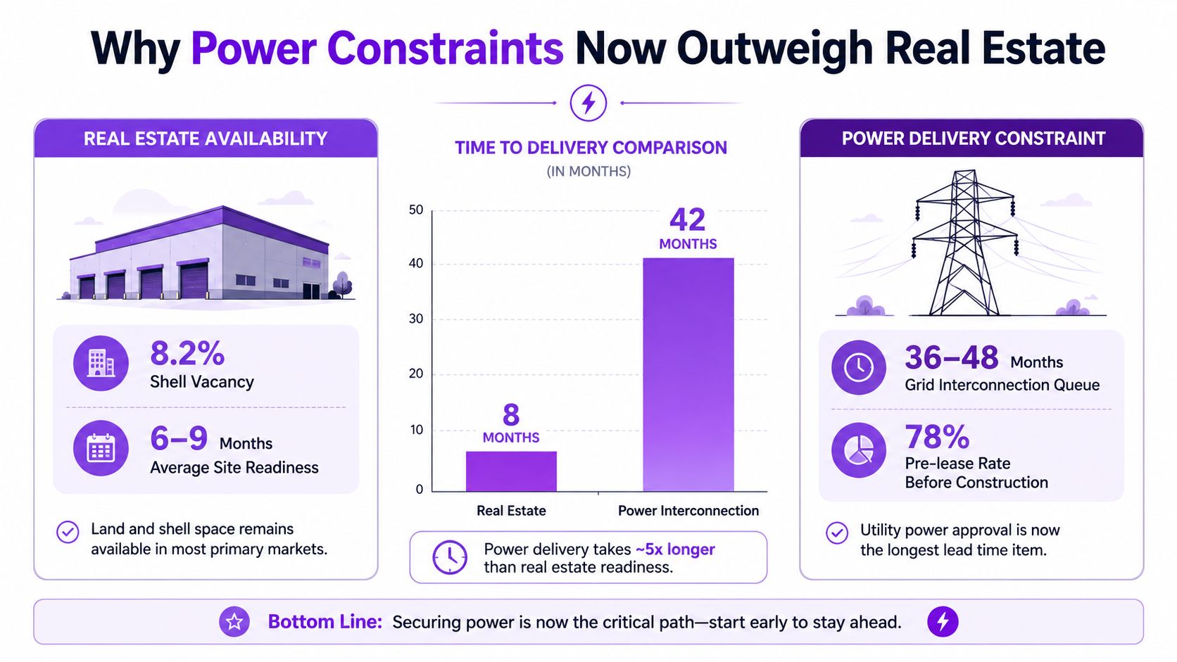
Vacancy can rise while access remains difficult. Recent CBRE global data center trends coverage describes primary-market vacancy at 1.4% to 1.6% in 2025 and 2026, even as inventory and under-construction supply expand. It also identifies power availability as the prime inhibitor in core hubs, with developers moving toward secondary markets and extending construction timelines into 2027 and beyond.
The implication is direct. A market can have land, shells, and a visible construction pipeline, yet still lack deliverable capacity for a buyer that needs a large energized block. Supply growth doesn't automatically improve access when new inventory is preleased or waiting for grid service.
Replace vacancy-only analysis
A buyer, lender, or developer should add power and infrastructure fields to every market review:
- Utility release schedule: The expected dates for available capacity by phase.
- Substation headroom: The remaining deliverable capacity at the relevant connection point.
- Interconnection status: Whether the project has a queue position, study result, service agreement, or only an application.
- Cooling resources: Water availability, alternative cooling design, and local restrictions that could affect operations.
- Planning risk: Zoning actions, permitting changes, moratoriums, or community conditions that can pause delivery.
The Meta 1 GW Alberta campus profile illustrates why a facility record needs more than a name and a capacity field. Large projects require local context, development status, and power scrutiny before their announced MW can be treated as market supply.
Test the power path before counting the pipeline
The most useful question isn't “How much capacity has been announced?” It is “Which projects have a credible path to energized service, and when?” A project without a utility commitment may remain strategically important, but it shouldn't carry the same weight in a near-term availability calculation.
That distinction also explains why buyers can face tight conditions during a construction boom. If new phases are already committed or delayed, headline inventory rises while accessible capacity stays constrained. Power-ready status, not shell volume, increasingly determines whether a market can satisfy a large requirement.
A Repeatable Method for Your Own Market Analysis
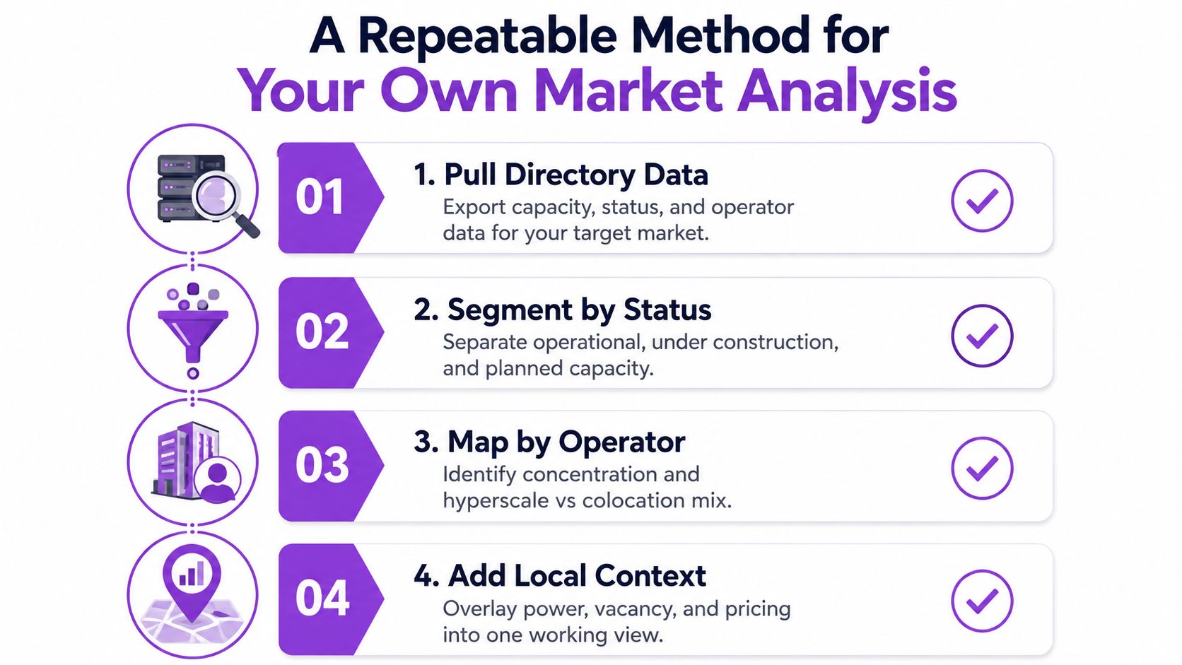
A repeatable workflow turns scattered facility records into a decision dataset. The process starts with directory exports, then adds ownership and local utility context. Each pass should preserve the source fields rather than overwriting uncertainty with a single headline number.
Four passes, four outputs
1. Pull directory data. Export every relevant facility with city, region, country, status, IT MW, operator, and capacity basis. The output is a raw inventory that can be filtered without losing proposed or incomplete records.
2. Segment by status. Create separate operational, under-construction, planned, and proposed totals. Keep disclosed and AI-estimated MW in separate columns. This produces a delivery-weighted supply view and prevents speculative capacity from blending into current inventory.
3. Map by operator. Normalize brand names, add parent company, and mark operating role. The resulting ownership table supports operational, near-term, and full-pipeline rankings while preserving the difference between colocation and hyperscale demand.
4. Add local context. Overlay utility territory, substation, interconnection status, commissioning year, vacancy, cooling resources, and relevant planning actions. The final output is a market-risk view, not just a capacity list.
Set a refresh cadence
Operational status and commissioning dates deserve frequent review because they can change the usable supply total. Construction records should be refreshed as milestones appear. Planned and proposed projects need a separate review because announcements can advance, stall, or change scope without becoming near-term capacity.
A concise analyst checklist should include:
- Status check: Is the facility energized, physically progressing, planned, or proposed?
- Capacity check: Is MW disclosed or estimated?
- Ownership check: Does the brand match the parent company and operating role?
- Power check: Is utility service documented for the relevant phase?
- Timing check: Does the target commissioning year align with construction evidence?
- Market check: Does vacancy reflect accessible capacity, or only total inventory?
- Risk check: Could grid, cooling, zoning, or permitting change the delivery path?
This routine produces a more credible answer than a single pipeline total. It identifies which MW exists today, which MW is advancing, and which MW remains conditional on power delivery.
Data Centers List provides a global directory and map of active, planned, and under-construction facilities, with operator, status, location, and disclosed or AI-estimated IT power fields for structured comparison. Analysts can visit Data Centers List to filter market inventories, consolidate operator footprints, and build a power-aware view of pipeline risk before making site-selection or investment decisions.