Map of Data Centers: A Complete Interactive Guide
Map of data centers - Explore interactive maps of data centers worldwide, compare locations, and find the best tools for network and infrastructure planning
13 min read
The global map of data centers ranges from 3,383 sites across 107 countries in one open map to 18,110 data centers across 116 countries in a separate atlas, and that spread is the point. A serious map now has to show not just where facilities sit, but how the underlying methodology changes the picture.
That difference turns a map from a visual aid into infrastructure intelligence. Once a map includes operational, planned, and under-construction facilities, plus capacity, operator, and status filters, it starts answering market questions that a static pin map never could.
Table of Contents
- Why Data Center Maps Matter More Than Ever
- Interactive Versus Static Data Center Maps
- Critical Map Layers and Filters
- Embedding and Using Data Center Maps
- Interpreting Marker Scaling Correctly
- Data Centers List as a Reference Model
- Building Your Data Center Mapping Strategy
Why Data Center Maps Matter More Than Ever
The gap between 3,383 mapped sites and 18,110 mapped data centers shows why a map of data centers can no longer be treated as a simple directory. The count changes with inclusion rules, geolocation standards, deduplication, and whether a platform includes pipeline assets or only verified facilities global mapping overview.
Methodology now shapes the market view
That difference matters because market concentration, regional coverage, and operator density look different depending on how the map is built. A platform that only shows verified coordinates will undercount some markets, while a broader dataset may surface more sites but mix certainty levels unless it labels those records clearly.
Practical rule: treat the map legend as seriously as the pins. If the map does not separate disclosed, estimated, planned, and operating assets, the visual can mislead more than it informs.
The strongest mapping products now behave like research layers, not showcases. They let analysts compare cities, regions, and operators without pretending that every record carries the same level of confidence. That matters most in markets where one national ecosystem can look small in a verified-only dataset and far larger in a pipeline-inclusive one.
Why scale and status now matter more than count
The sector's analytical center of gravity has shifted toward capacity, status, and coverage, not raw site totals. The best maps help users see where infrastructure is already running, where construction is underway, and where future demand is likely to land. Government research tools that layer current facilities with supporting infrastructure and growth projections set a stronger standard for strategic reading than a static pin collection.
That is why transparency is no longer optional. When a platform labels coordinate quality, source type, and facility status, it lets the reader decide whether the map is suitable for siting, policy analysis, or competitive benchmarking. Without that disclosure, the map may still look polished, but it is harder to trust for consequential decisions.
For a cleaner reference point, analysts often cross-check a live data centers list such as Data Centers List against mapped records to separate confirmed inventory from broader market coverage.
Interactive Versus Static Data Center Maps
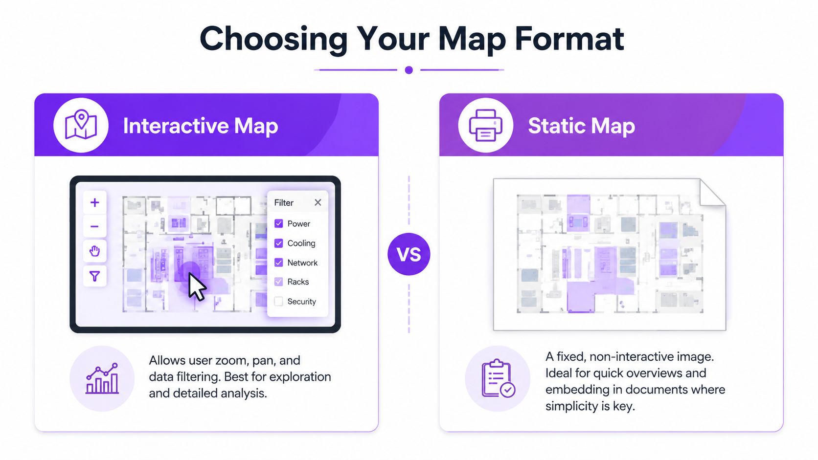
Static maps are useful when the audience needs a clean snapshot. Interactive maps are useful when the question changes as the user drills down into the dataset.
What static maps do well
A static map works for a board deck, a report appendix, or a printed briefing where the goal is to communicate one point quickly. It can show regional spread, a few prominent clusters, or the rough shape of a market without adding user friction.
The tradeoff is obvious. A static image can't let the reader separate operational sites from planned ones, toggle an overlay, or isolate one operator's footprint. It freezes the map at one moment and one interpretation.
What makes a map genuinely interactive
A real interactive map of data centers does more than let users click markers. It supports layer toggling, zoom-based clustering, filter persistence, and drill-down views that preserve context while narrowing the dataset.
A clickable map isn't the same as an analytical map.
Those features matter because analysts rarely ask one question. They may start with all facilities in a market, then narrow to operating sites, then compare only high-capacity facilities, then inspect operator concentration. If the platform loses filter state or collapses detail too aggressively, the analysis breaks.
Interactive maps also reveal whether the publisher cares about workflow or appearance. A true analytical tool helps a user move from overview to facility-level detail without reloading the entire frame. That saves time and reduces the risk of comparing mismatched views.
Critical Map Layers and Filters
The most valuable map layers are the ones that change interpretation, not decoration. In a serious data center map, the first filter should usually be status, because a planned site and an operating site answer different questions about supply, demand, and grid pressure.
Status, capacity, and location are the core analytical trio
A status layer separates reality from pipeline. A capacity layer shows concentration patterns, and a location layer places those facilities in city, region, and country context. Those three together can tell a much clearer market story than a dense field of pins.
| Layer | What It Reveals | Primary Use Case |
|---|---|---|
| Status | Whether a facility is operating, planned, or under construction | Distinguishing current supply from future pipeline |
| Capacity | Where megawatts are concentrated | Comparing market scale and operator footprint |
| Location | City, region, and country placement | Regional clustering and jurisdictional analysis |
| Operator | Which brand controls the asset | Measuring concentration by owner or developer |
| Water stress | Where siting may face sustainability constraints | Screening markets for resource pressure |
Why disclosed versus estimated values matter first
Facility-level benchmarking only works when the map separates disclosed and estimated capacity. That distinction prevents false precision and keeps analysts from comparing a verified figure with an inferred one as if they were identical.
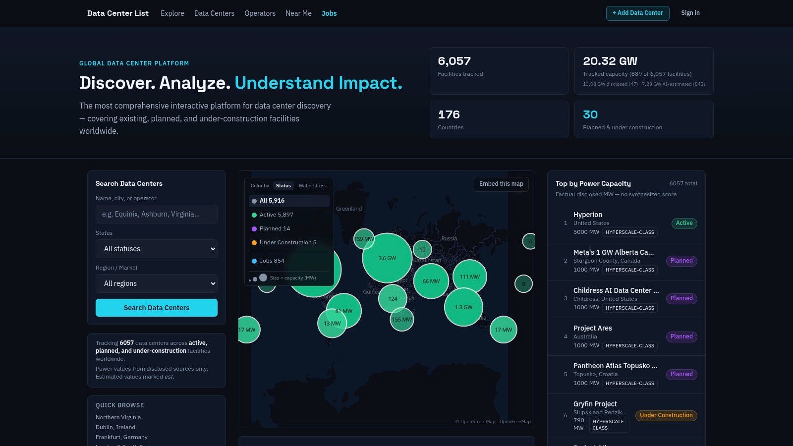
Data Centers List says it tracks facility fields across 6,024 facilities, and its research explorer exposes latitude, longitude, PUE, fully built-out power in MW, whitespace, building size, and year operational, which is exactly the sort of field structure that supports comparative analysis Data Centers List. When those fields are exportable, the map becomes a dataset instead of a dashboard.
What water overlays add
Water-stress overlays change the siting conversation. They show where facility growth may collide with local resource constraints, which matters for communities, regulators, and developers deciding whether a site is viable.
Used together, these layers turn a map into a planning instrument. The reader can see where concentration is already high, where future power demand is forming, and where environmental conditions may complicate expansion. That combination is more actionable than any single layer on its own.
Embedding and Using Data Center Maps
Embedding a data center map only works when the map keeps its analytical value outside the original platform. A good embed preserves filters, exposes useful defaults, and updates often enough that the display doesn't drift away from the source dataset.
What to check before embedding
The first question is whether the widget keeps the same filter logic as the main map. If the embed strips out status filtering, hides capacity fields, or removes location context, it can't support serious analysis.
The second question is freshness. A map that looks current but updates rarely can create false confidence, especially in fast-moving markets where planned capacity is changing quickly. The user should verify whether the embedded view inherits the parent platform's refresh cadence or only a snapshot.
The third question is consistency. A field that appears in the full platform should not disappear from the embed without a clear reason. If the public map uses capacity scaling and status labels, the embedded version should reflect that same structure so the reader doesn't compare two different analytical models.
How to avoid misrepresentation
Any team publishing an embedded map should distinguish verified values from estimated ones in the surrounding copy. That matters because a visually polished embed can make an inferred figure seem confirmed unless the label is explicit.
Compliance note: the safest display practice is to mirror the platform's own methodology labels, then describe any uncertainty in the caption or surrounding text.
That applies to capacity fields, operational status, and any contextual overlays. If a map is used in an investor deck, policy memo, or public-facing page, the presentation should never imply a level of precision the dataset doesn't support. A clear caption is better than a confident but ambiguous graphic.
Interpreting Marker Scaling Correctly
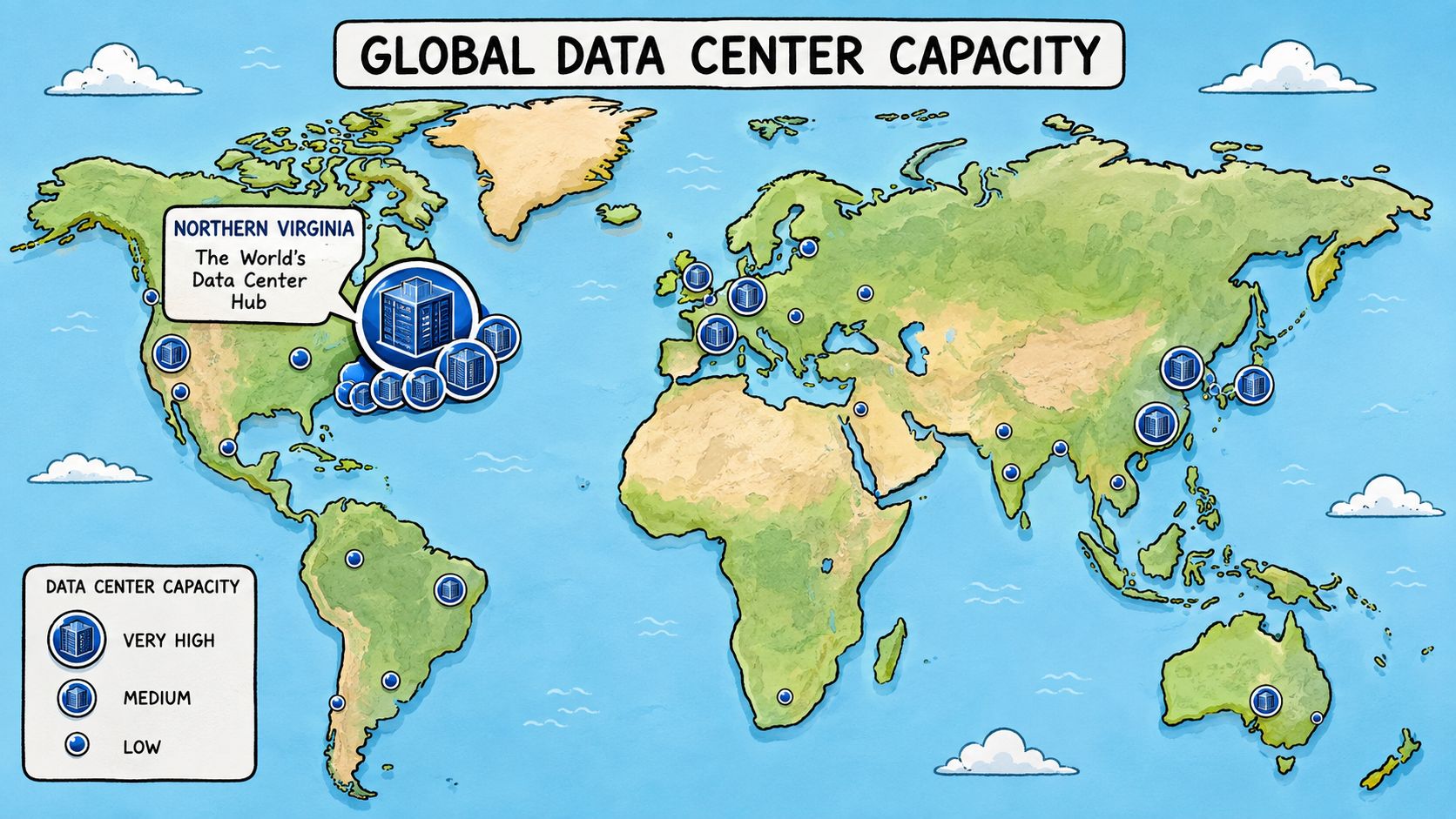
Marker scaling is where many viewers misread a data center map. A larger circle can mean more capacity, not necessarily more facilities, and that difference changes the entire interpretation of the visual.
Capacity markers can compress or distort the picture
When a map scales markers by IT power in MW, a small number of large sites can dominate the visual field. That can be useful if the goal is to identify where capacity is concentrated, but it can also hide the broader distribution of smaller facilities.
A cluster of modest markers may represent a dense operational market, while a few oversized markers can signal hyperscale concentration. The same visual choice can highlight one story and obscure another, depending on what the user is trying to learn.
If the marker size isn't explained, assume the map is encoding capacity, not count.
That's why analysts should inspect the legend before drawing any conclusion. A map can look geographically balanced while concentrating most capacity in a handful of visible hubs. It can also look sparse if the platform uses clustering at wider zoom levels and only reveals detail after drilling in.
Cluster logic matters as much as marker size
Clustering is useful because it reduces visual clutter. It's also risky because it can hide submarket structure, especially in dense metros where multiple facilities sit close together.
The right approach is to use clustering as a navigation aid, not as proof that a market is shallow. Once the user zooms in, the map should reveal the underlying facility-level records so the density can be evaluated properly. If it doesn't, the display is optimized for presentation, not analysis.
The internal example at Teraco Johannesburg Bredell Campus illustrates why facility-level detail matters. A single record can carry location, operator, status, and capacity context that a cluster icon can't communicate on its own.
Reading the scale honestly
The safest reading rule is simple. Treat marker size as an encoding choice, not a neutral fact. Then verify whether the platform is showing capacity, area, or some blended proxy before using the map in a market comparison.
Data Centers List as a Reference Model
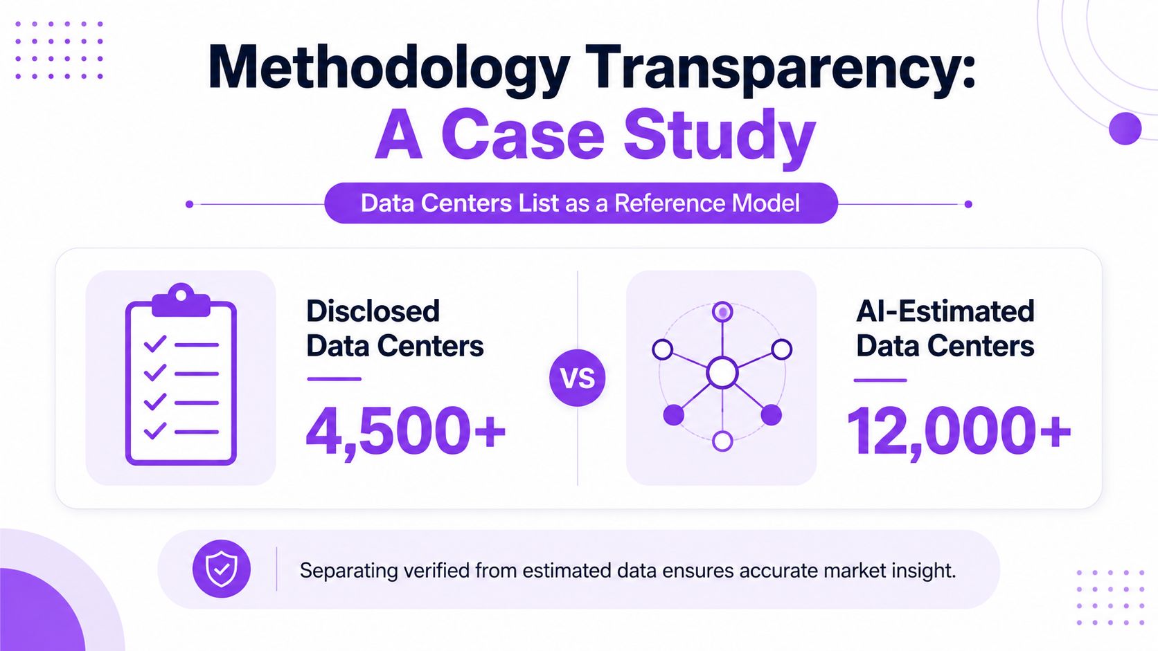
A useful reference model shows how the map, the dataset, and the labels work together. It makes it easier to separate confirmed records from inferred capacity, and current inventory from the pipeline.
What the platform structure makes visible
The map and directory structure surface existing, planned, and under-construction facilities together. That matters because the future pipeline can exceed the live inventory in fast-growing markets, which changes how concentration and supply should be read. The structure is useful for more than browsing, since it supports market concentration analysis, operator comparison, and regional screening.
The facility profile fields provide the core value here, especially the records at Data Centers List facility profiles. City, region, country, operator, status, and IT power in MW give the user a common framework for comparing markets that would otherwise be described in different formats and with different levels of precision. When the map uses those fields consistently, the reader can compare assets without rebuilding the dataset first.
Why transparency improves trust
Separating disclosed from AI-estimated capacity reduces the risk of false equivalence. A verified number and an estimated number can both be useful, but they should not be treated as the same class of evidence.
The searchable table and ranked views also matter because they make the map auditable. Analysts can sort by capacity, status, or location and inspect how the underlying records are organized instead of relying only on a visual summary. That gives developers, investors, and public stakeholders a clearer basis for discussion.
What the market view adds
The quick-browse views for major markets and operator listings help surface concentration patterns that are easy to miss in a broad world map. Those views turn a global directory into a market research tool, especially when the question is who controls the footprint in a given region.
The result is not just a polished interface. It is a layered model that keeps the methodological assumptions visible, which is what serious infrastructure mapping should do. A map that cannot explain its own records will struggle to support high-stakes analysis for long.
Building Your Data Center Mapping Strategy
The right data center mapping strategy starts with a narrow question. A site-selection review, a policy memo, and a competitive environment scan all need different filters, different levels of certainty, and different tolerance for estimated fields.
Use the map to answer one question at a time
For market size, prioritize status and capacity. For operator concentration, prioritize brand grouping and regional sorting. For local impact, prioritize location, water context, and whether the record is operational or still in the pipeline.
A practical checklist keeps the analysis honest:
- Confirm the status model. Decide whether the map includes operating, planned, and under-construction sites, or only live facilities.
- Check capacity labels. Separate disclosed values from estimated ones before comparing markets.
- Inspect the legend. Make sure marker size, clustering, and color coding are all explained clearly.
- Verify the source mix. The best maps say whether they rely on public records, open data, or operator disclosures.
- Match the map to the decision. A public briefing needs clarity, while a site screening exercise needs facility-level depth.
A map is only as strong as the questions it can answer without hand-waving.
When a map isn't enough on its own
Maps should be paired with direct operator inquiry when the decision depends on tight capacity confidence or permit-level detail. That matters especially where the public record is incomplete or where expansion plans are still shifting.
The strongest process is iterative. Start with the map, identify the markets or facilities that matter, then verify the most consequential records against public filings and operator statements. That sequence keeps the analysis grounded without losing speed.
For teams that need a starting point, Data Centers List can serve as one structured source for facility-level location, status, and capacity context. The broader lesson is simple, though, a map of data centers is only useful when its methodology is visible enough to support real decisions.
If the goal is to compare markets, track pipeline growth, or separate disclosed capacity from estimates, visit Data Centers List and use the map as a starting point for deeper facility-level analysis. The platform's layered directory, status labels, and capacity fields make it easier to evaluate concentration without flattening the differences that matter.