Global Data Center Map: A Practical Guide for 2026
Explore the global data center map for 2026 — what it shows, which overlays matter, and how operators, analysts, and site selectors use it to plan capacity.
16 min read
The global data center map is no longer a directory of buildings. It is becoming a planning instrument for a market that consumed 415 TWh of electricity in 2024, equivalent to about 1.5% of global electricity use, according to Cushman & Wakefield's power challenge research. A useful map must therefore show more than where facilities sit. It must help users judge whether power, water, connectivity, and pipeline capacity can support what comes next.
The distinction matters because a dense cluster of pins can represent energized inventory, speculative announcements, or capacity inferred from incomplete evidence. Senior operators, investors, site selectors, and community stakeholders need to know which is which before they treat a mapped market as investable, buildable, or acceptable.
Table of Contents
- What a Global Data Center Map Actually Shows
- The Core Layers That Make a Map Useful
- How Market Concentration Shapes What the Map Reveals
- Reading Overlays for Water and Power Constraints
- Why Disclosed and Estimated Capacity Must Be Separated
- How Different Audiences Use the Same Map
- Embedding and Widget Options for Your Own Workflow
- Turning the Map into Better Decisions
What a Global Data Center Map Actually Shows
A global data center map is an interactive geographic index of facilities, usually organized by location, operator, status, facility type, and IT capacity. The strongest versions allow a user to move from a country view to a regional cluster and then to an individual campus, while preserving the evidence attached to each record.
The scale of the underlying market explains why a simple pin directory isn't enough. Synergy Research Group counted 992 large hyperscale facilities worldwide at the end of 2023, passed the 1,000-site mark in early 2024, and recorded 1,136 by the end of 2024 in its hyperscale facility count. The hyperscale fleet doubled in roughly five years, while total hyperscale capacity doubled in four years. A map that records only operating addresses will miss much of the commercial and infrastructure decision.
Start with inventory, then test certainty
The first test is whether a map separates:
- Operational facilities, which are serving workloads or tenants.
- Under-construction facilities, where physical delivery is underway.
- Planned facilities, which may have a site, announcement, or development pathway.
- Speculative capacity, where the evidence is weaker or the project remains conceptual.
Those labels aren't cosmetic. A planned campus can influence land prices, utility negotiations, and community debate long before it contributes energized IT load. Treating it as equivalent to an operating facility turns a forward-looking layer into a false inventory statement.
A practical starting point is the global data center directory, where users can examine facilities through location and status fields rather than relying on a visual heatmap alone. The map becomes useful when every pin leads to a record with provenance, not merely a colored dot.
Read the map as a planning surface
The second test is whether the map adds context around each facility. Power capacity should connect to utility and interconnection conditions. Water-stress data should sit beside cooling assumptions and local hydrology. Connectivity layers should show why a site can serve a particular workload, rather than implying that geographic proximity automatically produces acceptable latency.
The right question isn't “How many data centers are in this country?” It is “Which capacity is live, which capacity is credible, and which constraints could prevent the next phase from arriving?” That shift turns a map from a directory into an analytical surface.
The Core Layers That Make a Map Useful
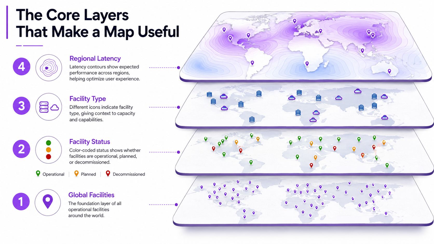
A site selector rarely makes a decision from one map layer. The work proceeds from physical inventory to certainty, scale, ownership, connectivity, and constraints. Each layer answers a different operational question, and omitting one can make the remaining layers misleading.
Build outward from the facility layer
The base layer shows the physical sites. It should distinguish individual buildings from larger campuses where the available data permits, because a single campus can contain multiple phases and operational states. A cluster tells a user where activity is concentrated. It doesn't yet explain how much capacity exists or whether additional development is realistic.
The next layer is facility status. Operational, under construction, planned, and speculative records should remain visually distinct. A map that combines them into one marker set creates an inflated impression of current supply.
Capacity changes the decision
IT load, measured in megawatts, is more useful for infrastructure planning than rack counts or gross building area. It connects the facility to power procurement, utility planning, cooling design, and campus expansion. Capacity should also carry a provenance flag, because an operator-confirmed figure and an inferred estimate don't support the same conclusion.
Ownership and operator relationships provide another essential layer. A tenant may pre-commit space inside a facility without owning the building, while a hyperscale operator may occupy several campuses under different delivery arrangements. A consolidated operator directory helps users examine those relationships without confusing brand presence with directly owned capacity.
Connectivity and policy complete the picture
Fiber routes, internet exchange points, and submarine cable landings help explain latency and network resilience. They don't replace workload-specific testing, but they provide the geographic context for comparing markets.
Policy and grid layers then answer the harder question: can the market absorb more development? Moratorium zones, renewable power purchase agreements, utility headroom, transmission projects, and permitting conditions can change the interpretation of a seemingly attractive cluster. The hierarchy is deliberate. Analysts move from where, to how much, to who, to how connected, and finally to whether the surrounding system can support growth.
How Market Concentration Shapes What the Map Reveals
Market concentration changes the meaning of visual density. A large cluster may indicate mature inventory and deep connectivity, or it may show a development pipeline assembled around scarce power. The map needs status and capacity fields to distinguish those conditions.
CBRE reported that Northern Virginia remained the largest global data center market, while inventory in North America's four largest markets rose 43% year over year in Q1 2025. Europe's four largest markets rose 7.2% over the same interval, with power-delivery constraints limiting expansion, according to CBRE's global data center trends report.
That gap creates a visual asymmetry. Northern Virginia can show both dense operating inventory and an extensive pipeline, while major European markets can show strong demand alongside slower physical delivery. Europe's core markets later reached 18.9% growth after earlier power bottlenecks eased, and Northern Virginia added 1,135.9 MW year over year in CBRE's subsequent update. These figures describe changing delivery conditions, not just changes in geographic interest.
A comparison table needs provenance
The requested market comparison cannot be completed responsibly from the verified data available here. No market-level 2024 net absorption figures were provided for Northern Virginia, Frankfurt, Dublin, Phoenix, or other individual markets. Substituting estimates would make the table appear precise while weakening the analysis.
| Market | 2024 Net Absorption (MW) | Primary Status | Key Constraint |
|---|---|---|---|
| Northern Virginia | Not provided in verified data | Largest global market | Power delivery and grid availability |
| Europe's four largest markets | Not provided in verified data | Major regional cluster | Power-delivery constraints |
| Other markets | Not provided in verified data | Varies by facility and pipeline | Requires facility-level verification |
Separate mature clusters from speculative overlays
A map reader should ask whether each cluster represents energized capacity, construction that has started, or announcements that still depend on land, permits, transmission, and utility agreements. A large announced project in a constrained grid isn't equivalent to an operating campus with proven interconnection.
The same logic applies to secondary markets. They can function as geographic or power hedges when primary hubs face ceilings, but a less crowded map doesn't prove that a market has sufficient transmission, carrier diversity, water availability, or permitting capacity. The useful conclusion is narrower: concentration identifies pressure points, while status labels reveal how much of the apparent relief is real and how much remains contingent.
Reading Overlays for Water and Power Constraints
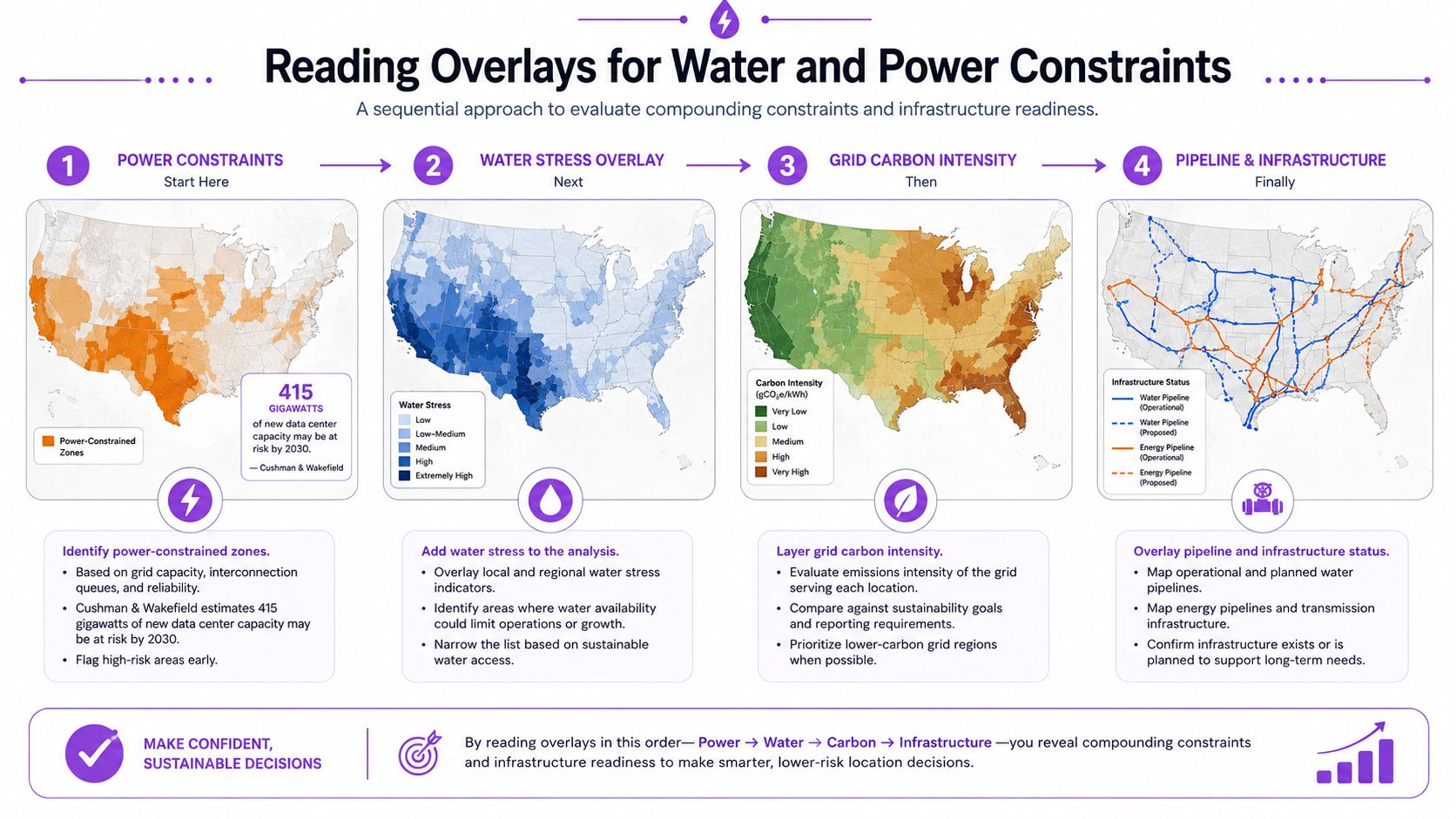
The map should be read in an order that reflects operator risk. Power comes first because a site without deliverable electricity can't become usable IT capacity. Water follows because cooling design, permitting, and operating cost depend on local hydrology. Carbon intensity and pipeline status then refine the shortlist.
The electricity burden is already material. Cushman & Wakefield states that the global data centre sector consumed 415 TWh in 2024, about 1.5% of global electricity, and had grown at an average 12% annually over the prior five years in its power challenge research. That demand makes utility context a core map function rather than an optional sustainability filter.
Apply the overlays in sequence
A practical reading sequence looks like this:
- Power constraints: Turn on utility service areas, substations, transmission limits, and interconnection queues. The overlay should identify whether a parcel has plausible access to deliverable capacity, not merely whether a line appears nearby.
- Water stress: Add basin or regional water-stress bands after the power screen. A dry-market designation can change the preferred cooling architecture, permitting pathway, and total cost assumptions.
- Grid carbon intensity: Use carbon context to distinguish nominally available power from power that aligns with a project's emissions strategy or procurement objectives.
- Pipeline status: Separate operating, under-construction, planned, and speculative capacity. This prevents a future campus from being counted as current supply.
The visual design matters. Color bands can show regional stress, hatched zones can flag constrained infrastructure, and point clusters can identify queue or permitting pressure. A parcel that looks attractive on a plain capacity map may become unsuitable after a water overlay turns high-risk or a substation indicator shows limited headroom.
Treat Northern Virginia as a layered example
Northern Virginia demonstrates why land availability is only one part of site selection. A PJM interconnection queue overlay can change the apparent availability of parcels in Loudoun and Prince William counties by showing whether new load can receive service on a realistic schedule. The map doesn't replace a utility study or a formal interconnection process. It tells the analyst where those deeper checks are most urgent.
Practical rule: A location should remain on the shortlist only after its power and water layers have been read together.
Why Disclosed and Estimated Capacity Must Be Separated
A capacity number has meaning only when its provenance is visible. Disclosed capacity comes from an operator filing, press release, planning document, regulatory record, or another public statement tied to a specific facility. AI-estimated capacity is inferred from indirect evidence such as building area, power agreements, satellite imagery, or patterns across a facility cluster.
The two categories can coexist on one map, but they shouldn't be interpreted as equivalent. A disclosed figure may still change as a project is phased. An estimate may be directionally useful for identifying an overlooked cluster, yet unsuitable for underwriting, permitting analysis, or a community claim.
The comparison is about decision confidence
| Attribute | Disclosed Capacity | AI-Estimated Capacity |
|---|---|---|
| Evidence | Tied to an operator, facility, filing, announcement, or public record | Inferred from indirect signals and comparable facility patterns |
| Confidence interval | Usually narrower, though phase and timing still require checking | Wider because assumptions can affect the result |
| Refresh cadence | Changes when the operator or public record updates | Changes when the underlying signals or model are refreshed |
| Legal defensibility | Stronger when the source is specific and archived | Limited unless the methodology and inputs are documented |
| Double-counting risk | Lower when facilities and phases are uniquely identified | Higher when one campus appears across several data signals |
| Best use | Investment diligence, utility discussions, and formal analysis | Market discovery, screening, and hypothesis generation |
Provenance should control the map's visual language
A map can show disclosed and estimated figures with separate colors, symbols, or filters. It can also let users export the two sets independently. That separation matters because overlays compound uncertainty: water demand or power pressure layered over an estimate inherits uncertainty from both the capacity assumption and the local constraint data.
The practical rule is simple.
Any capacity figure without a provenance label is directional, not investable.
This doesn't make estimated data useless. It gives it the correct job. Estimates can identify where further research belongs. Disclosed figures can support the next stage of diligence, provided the analyst also checks status, phase, utility conditions, and update date.
How Different Audiences Use the Same Map
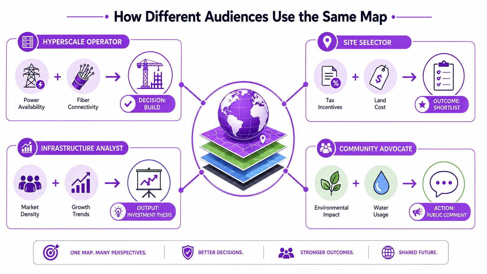
A hyperscale operator, a site selector, an infrastructure analyst, and a community advocate can open the same global data center map and reach different conclusions. Their questions differ because each person carries a different risk.
The operator begins with the pipeline. A proposed campus is compared with peer announcements in other major markets, not to copy their plans but to understand whether the project is entering a crowded power and connectivity environment. The operator then checks facility status, disclosed capacity, carrier access, renewable procurement options, and the timing of utility delivery. The map helps frame the decision, while engineering and commercial diligence determine whether the build proceeds.
Four decisions from one geographic record
The site selector starts with a longlist of markets and removes candidates that fail basic power, water, connectivity, or policy screens. The shortlist isn't based on pin density. It depends on whether the surviving markets have credible pipeline visibility and enough local infrastructure to support the intended workload.
The infrastructure analyst uses the map differently. Disclosed and estimated capacity are exported separately, then compared with market reports and operator statements. Where the numbers diverge, the discrepancy becomes a diligence question rather than an automatic error. A cluster with high estimated capacity but little disclosed evidence may signal incomplete public coverage, double counting, or speculative development.
The community advocate focuses on externalities. Zoning, moratorium, water-stress, and facility-status overlays can show whether proposed development intersects a residential water district or an already dense infrastructure corridor. That view doesn't decide whether a project is beneficial or harmful. It identifies the records, resource questions, and public processes that deserve scrutiny.
The map must serve competing priorities
These users don't need identical dashboards. They need a shared factual base that preserves the distinction between current and future capacity, disclosed and inferred figures, and physical location and local constraints. A map that privileges only construction volume will serve developers while obscuring community risk. One that shows only environmental stress may miss the connectivity and economic reasons a market attracts investment.
The strongest workflow gives each audience a specific view while retaining the same underlying record. That makes disagreements more productive. Participants can debate assumptions and trade-offs instead of arguing over which facilities exist.
Embedding and Widget Options for Your Own Workflow
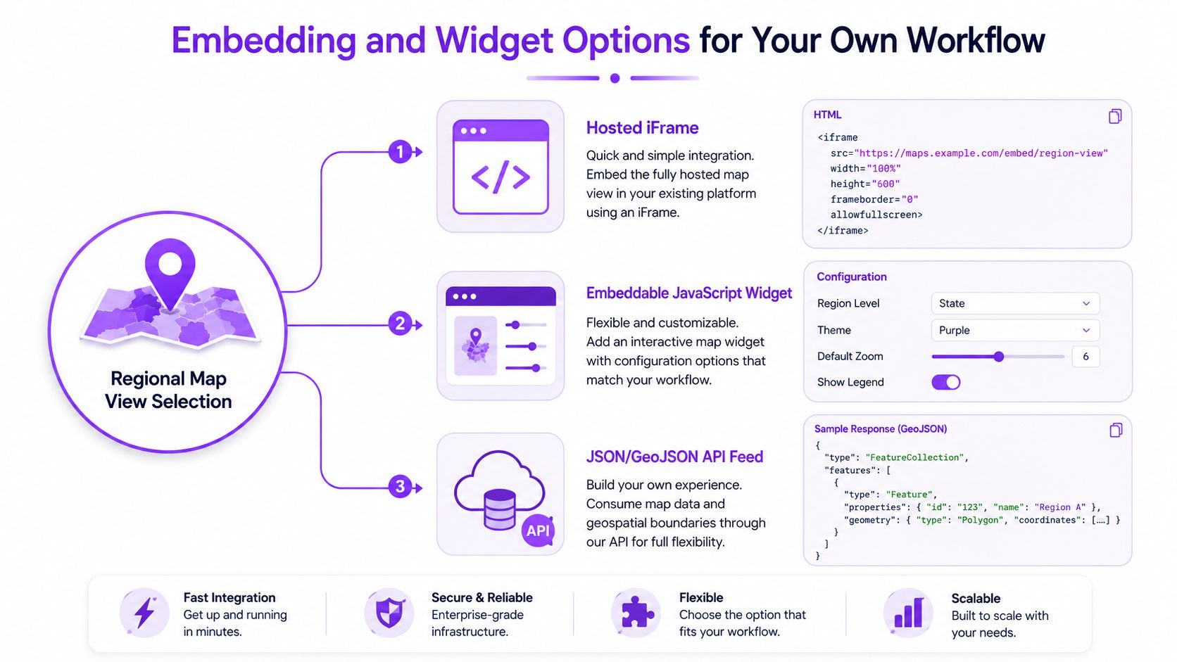
Enterprise teams generally use one of three integration paths: a hosted iframe, an embeddable JavaScript widget, or a JSON or GeoJSON feed delivered through an API. The choice depends on whether the audience needs a ready-made view, a configurable component, or a dataset that can be joined with proprietary information.
A hosted iframe is the simplest route for research notes, intranet pages, or presentations. It keeps the map provider responsible for the interface and updates, but it offers less control over how the view interacts with internal filters.
Choose the view before choosing the integration
A global view may suit executive context, while an EMEA or single-market view is easier to read inside a working document. Filters should be configured before the embed is generated. Status, facility type, operator, capacity provenance, and water-stress overlays need to match the audience's question.
The JavaScript widget usually fits internal teams that need a live, interactive component with configurable filters. The API route suits analysts building composite dashboards that combine map records with internal land, utility, or financial datasets.
Protect the workflow from integration friction
Teams should verify:
- Rate limits: Confirm how frequently the map or feed can be queried.
- Attribution rules: Preserve required credit inside internal and external views.
- Commercial reuse: Check whether the data can support client-facing or paid products.
- Update behavior: Determine whether refreshed status and capacity fields appear automatically.
- Schema stability: Confirm that field names and geographic identifiers won't change without notice.
The most common design mistake is embedding the default global view at full extent. A focused market view with a restrained height is usually more legible in research notes, portals, and slide decks. The map should support the document's decision, not compete with every surrounding element.
Turning the Map into Better Decisions
The strategic shift from directory to instrument depends on disciplined reading. Five habits make the difference:
- Start with disclosed MW: Use operator-confirmed or public-record capacity as the analytical anchor.
- Flag estimates visibly: Keep inferred figures separate and use them to identify research gaps.
- Treat status as conditional: Planned capacity is a possibility, not energized supply.
- Cross-check the grid: Compare pipeline growth with interconnection, transmission, and utility evidence.
- Pair water with power: A market that clears one constraint may fail the other.
- Refresh the view: Announcements, construction phases, and commissioning records don't move at the same pace.
The broader market context reinforces the need for this discipline. Synergy's data shows that the hyperscale fleet reached 1,136 facilities by the end of 2024, with the United States accounting for 51% of worldwide hyperscale capacity by critical IT load and Europe and China each representing about a third of the remainder, as reported in its hyperscale market update. A global map can expose concentration, but only layered evidence explains whether concentration represents opportunity or constraint.
Operators can use that evidence to time land banking. Site selectors can filter markets against utility and water headroom. Analysts can test disclosures against estimated coverage. Community advocates can locate proposed clusters where resource pressure deserves public attention. The data center predictive modeling resource is relevant when teams want to extend map records into forward-looking analysis.
A global data center map should be treated as a starting hypothesis, not a finished answer. The decision-grade workflow is the one that preserves provenance, distinguishes status, and reads capacity alongside power, water, connectivity, and pipeline risk.
Data Centers List provides an interactive global directory and map covering operational, planned, and under-construction facilities, with operator details, status fields, IT power, and disclosed-versus-AI-estimated capacity labels. Teams assessing market concentration, infrastructure constraints, or pipeline risk can use the facility records and map views as a structured starting point. Visit Data Centers List to explore the map and compare facilities by location, status, and capacity provenance.