8 Data Center Pic Examples Explained
Explore 8 data center pic examples, from server racks and cooling systems to campus exteriors, with practical analysis for site and capacity planning.
20 min read

A data center pic can reveal more than a polished exterior suggests. A visible rack layout may indicate airflow discipline, while a transformer yard can expose site constraints that a building brochure leaves unstated. Yet a photograph cannot prove IT power capacity, redundancy, water performance, or operational status on its own. The useful question is not whether an image looks modern, but what infrastructure decision it documents and what remains unverified.
This gallery treats each image as an analytical source. Every example pairs a precise caption with a visual reading, a strategic implication, and a practical evaluation method. Interior photographs are strongest for examining equipment density, cable organization, cooling design, monitoring, and access controls. Exterior photographs are more useful for assessing land use, utility interfaces, security boundaries, transport, and community context.
The method works best when visual evidence is paired with structured facility data. A directory can identify the operator, market, status, IT power field, and water-stress context, while clearly separating disclosed capacity from AI-estimated capacity. That distinction matters because an attractive facility can still face a local power queue, limited water availability, or weak expansion options. The eight examples below show how to turn a representative image into a disciplined due-diligence prompt.
Table of Contents
- 1. Server Racks and Equipment Density
- 2. Structured Cabling and Network Infrastructure
- 3. Cooling Systems and Thermal Management
- 4. Electrical Power Distribution and UPS Systems
- 5. Physical Security and Access Control
- 6. Control Rooms and Building Management Systems
- 7. Exterior Infrastructure and Site Planning
- 8. Modular and Prefabricated Data Center Units
- 8-Point Data Center Comparison
- Turn Visual Evidence Into Better Decisions
1. Server Racks and Equipment Density
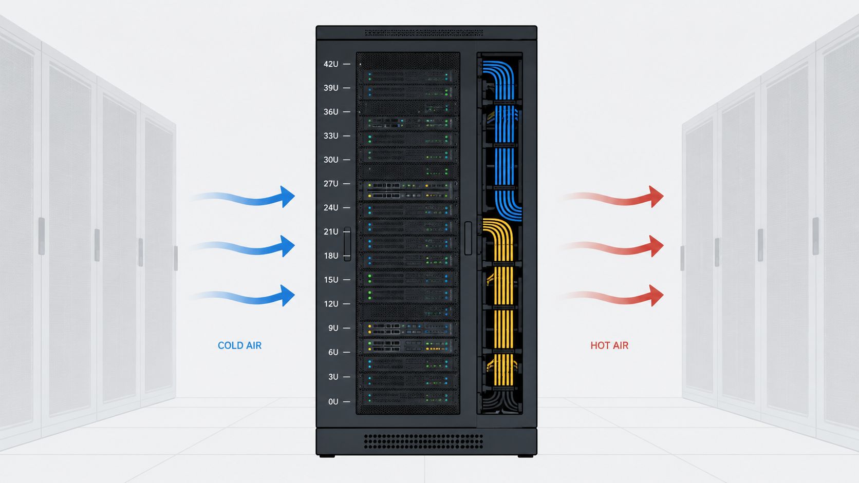
A rack photograph offers the clearest visual starting point for estimating how a facility handles computing density. The image can show rack height, spacing, blanking panels, cable direction, aisle orientation, and whether equipment faces a consistent cold or hot side. Those observations help analysts distinguish a disciplined deployment from an improvised one, but they don't establish the site's total capacity.
Read the rack, not the branding
A tightly packed rack may support more computing in the same floor area, yet it also places greater demands on power delivery and heat removal. A mostly empty rack may indicate spare capacity, a recently commissioned hall, customer churn, or a staged expansion. The image alone can't identify which explanation is correct.
The cold-to-hot airflow arrangement visible in this data center pic is strategically important. When operators separate supply air from exhaust air, they make thermal behavior easier to control and reduce the risk that hot exhaust returns to server intakes. Analysts should inspect whether aisle containment, floor grilles, and rack blanking appear consistent across the room.
Practical rule: Treat rack density as a clue for IT-load modeling, never as a substitute for a disclosed MW figure.
A useful review records three layers of evidence:
- Visible configuration: Note rack occupancy, spacing, airflow direction, cable placement, and signs of liquid-cooling equipment.
- Operational question: Ask whether the electrical room and cooling plant can support the apparent density across the full hall.
- Directory verification: Compare the photograph with the facility's operator, market, status, and capacity record, including any label identifying capacity as disclosed or AI-estimated.
Server sprawl also changes the meaning of a crowded room. Distributed, lightly utilized equipment may consume space and cooling capacity without delivering equivalent productive load. The server sprawl analysis provides a useful context for asking whether visible hardware reflects planned capacity, inefficient deployment, or a transitional installation.
2. Structured Cabling and Network Infrastructure
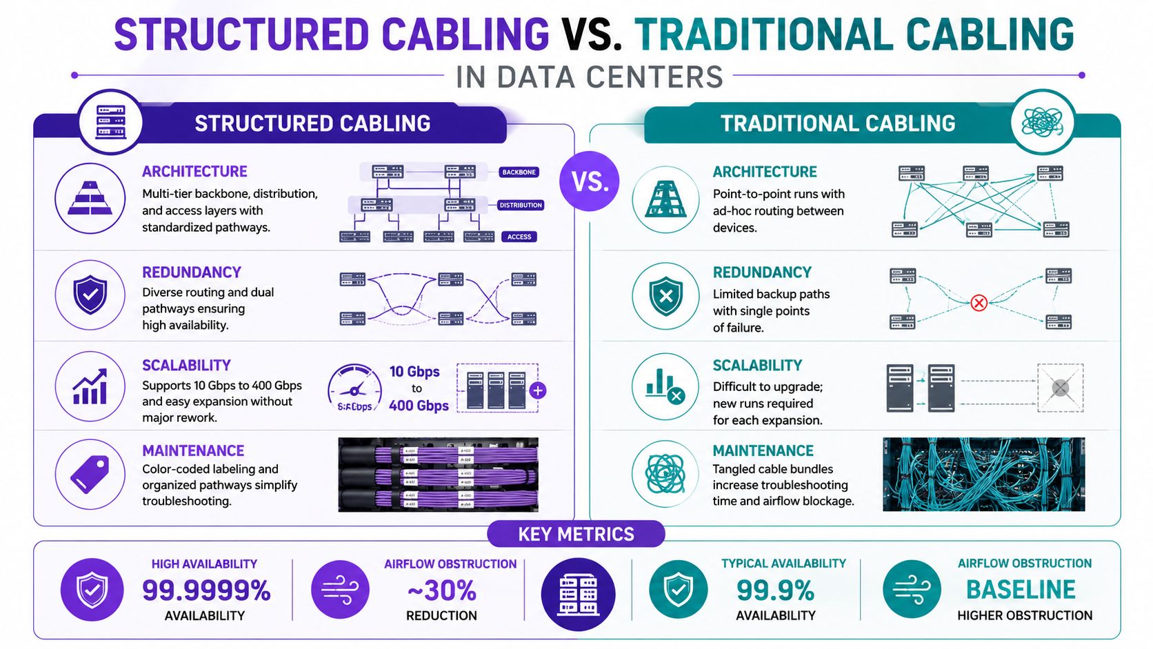
A cabling image reveals whether the facility has organized its connectivity for maintenance and growth. Fiber trays, overhead pathways, patch panels, and separation between power and network routes can show how operators reduce accidental disconnection risks. A neat photograph doesn't prove resilience, but disorder can expose avoidable operational friction.
Follow the path to the failure point
The strongest visual clue is routing diversity. Separate cable paths that leave the room through different directions suggest that the design may limit dependence on one tray or penetration. Analysts still need documentation to verify whether those routes reach independent meet-me rooms, carriers, and utility entrances.
Cable management also affects cooling. Dense, unmanaged bundles can obstruct airflow beneath racks or complicate access during replacement work. Well-supported pathways keep fiber above or beside the equipment zone, reduce strain on connectors, and leave room for technicians to trace a circuit without disturbing unrelated services.
A real-world comparison helps explain why the image matters. A carrier hotel or colocation site with many customers may display a much more intricate cable plant than a single-tenant cloud hall. Complexity isn't automatically a weakness. The key question is whether the operator documents every connection and maintains clear separation between active routes and future expansion space.
Convert visible order into due diligence
A reviewer can annotate the image with four questions:
- Route diversity: Do primary and backup connections appear to follow separate physical paths?
- Capacity headroom: Are trays and patch panels already full, or is there visible room for expansion?
- Maintenance access: Can technicians reach connectors without crossing active power or airflow zones?
- Documentation maturity: Does the operator provide DCIM or customer-facing records that match the visible plant?
The 165 Halsey meet-me room profile illustrates why network context belongs beside the image. A photograph shows the local cable arrangement. A facility record can add the market and site identity needed to investigate carriers, interconnection role, and operating status.
3. Cooling Systems and Thermal Management
Cooling is where a visually impressive data center can produce a misleading first impression. A clean aisle, visible containment, or large mechanical plant suggests design intent, but it doesn't prove efficient operation. The meaningful evidence comes from the relationship between cooling equipment, climate, water availability, workload density, and measured performance.
PUE and WUE answer different questions
Power Usage Effectiveness, or PUE, helps assess how much facility energy supports IT equipment rather than overhead systems. Water Usage Effectiveness, or WUE, addresses water associated with IT operations. Neither metric should be inferred from an image.
The Phoenix case study is a useful warning against treating PUE and WUE as interchangeable. In two colocation facilities in a hot-arid climate, the site with nearly 13% higher average PUE achieved 66% lower source WUE than its peer, according to the Arizona case study on water-energy tradeoffs. The finding means an image of chillers or evaporative equipment must be interpreted alongside the water footprint of the local utility and the facility's operating conditions.
The same study found that hybrid evaporative cooling used the least power, while air-cooled chillers used the most water. Free cooling and evaporative cooling were available for about 40% of the year under suitable outdoor conditions, showing why climate-responsive controls can matter as much as equipment selection.
Cooling equipment should be judged as a local system, not as a universal sign of sustainability.
Inspect the plant in context
A reviewer should identify whether the image shows air handlers, cooling towers, chillers, dry coolers, or liquid-cooling distribution. Then the reviewer should ask:
- Climate fit: Does the design suit local temperature and humidity conditions?
- Water exposure: Does the system rely on evaporation in a water-stressed market?
- Workload fit: Can it manage the heat profile suggested by the racks?
- Redundancy: Are reserve cooling paths visible or documented elsewhere?
The Syracuse University green data center profile adds the facility-level context a cooling image can't provide. The comparison should focus on reported or estimated metrics, not on visual appearance alone.
4. Electrical Power Distribution and UPS Systems
Electrical rooms rarely make compelling marketing images, but they contain some of the strongest clues about capacity and resilience. Switchgear, busways, UPS cabinets, battery systems, generators, and transfer equipment reveal how electricity moves from the grid to the IT load. A photograph can show architecture. It can't confirm the energized rating, fuel autonomy, or independence of each path.
Trace the power chain
The analysis should begin at the utility entrance and follow the sequence through switchgear, transformers, UPS systems, distribution panels, and rack-level delivery. A visible second bus or additional UPS line may suggest redundancy, but it may also serve a different load zone or remain uncommissioned.
The scale of modern facilities makes this distinction important. The International Energy Agency notes that a typical data center often requires 5 to 10 MW, while hyperscale sites can require 100 MW or more. Its commentary also compares the annual electricity use of such a 100 MW facility with roughly 350,000 to 400,000 electric cars, demonstrating why a single campus can affect utility planning. These figures are documented in the IEA analysis of data centers and the energy sector.
The image should therefore lead to a capacity reconciliation exercise. If a facility profile lists IT power, analysts can compare that figure with visible or documented substation, UPS, and generator arrangements. If the capacity is AI-estimated, the estimate should remain clearly labeled rather than presented as an operator disclosure.
Test resilience rather than counting equipment
- Utility diversity: Check whether independent feeds are documented, not merely whether multiple cables enter the building.
- UPS architecture: Determine whether units operate in a redundant arrangement and whether battery systems support the intended bridge period.
- Generator readiness: Verify fuel arrangements, testing procedures, and environmental permitting.
- Expansion path: Ask whether spare switchgear positions and transformer capacity support the development pipeline.
A power photograph becomes strategically valuable when it exposes the difference between nameplate infrastructure and deliverable capacity. Local interconnection timing, substation upgrades, and transmission availability can constrain a project long before the building reaches its physical limit.
5. Physical Security and Access Control
Security photographs often show fences, gates, cameras, bollards, badge readers, or guarded entrances. These features reveal how the facility separates public space from operational space, but they don't prove the quality of incident response or compliance controls. The image is best treated as evidence of the site's security model, not certification.
Look for layered protection
A mature facility typically makes access progressively narrower. Public roads lead to controlled vehicle access, then a reception or screening point, followed by authenticated entry into technical areas. Camera coverage, perimeter detection, visitor procedures, and emergency access arrangements should work together rather than exist as disconnected features.
A real-world scenario shows why exterior context matters. A colocation building in a dense urban market may need stronger pedestrian separation and visitor management than a remote hyperscale campus. The urban site also faces different community questions, including traffic, noise, emergency access, and the effect of security infrastructure on neighboring properties.
Security can support commercial trust, but an image can't establish a SOC 2 or ISO 27001 control environment. Analysts should request the relevant audit scope and determine whether it covers the facility, the operator's processes, or a separate service layer. A badge reader is visible evidence of controlled entry. It isn't evidence that every privileged action is logged and reviewed.
Security maturity appears in the relationship between barriers, procedures, monitoring, and recovery.
A visual review should record:
- Perimeter design: Identify fencing, setbacks, vehicle barriers, and unprotected approaches.
- Entry control: Note whether visitors, staff, vehicles, and equipment deliveries use separate processes.
- Monitoring: Look for camera placement and control-room integration, then request retention and response details.
- Community interface: Assess lighting, traffic patterns, noise sources, and how security affects the surrounding area.
The practical conclusion is narrow but useful. A data center pic can identify where a site may be exposed or overbuilt, while facility documentation must establish whether the controls operate continuously.
6. Control Rooms and Building Management Systems
A control-room image reveals how operators convert infrastructure signals into action. Wall displays, alarm panels, building management system screens, infrastructure dashboards, and security feeds show which conditions receive attention and how staff may detect a fault. Screen count offers little evidence by itself. A stronger assessment examines system integration, alarm quality, permission controls, and procedures tested during failures.
The dashboard hierarchy matters. A useful control room brings together power, cooling, environmental conditions, network systems, physical security, and maintenance workflows. If these views remain isolated, an operator may see a temperature rise without connecting it to a failing fan, an overloaded circuit, or increasing rack demand. That separation can delay diagnosis and weaken capacity planning.
Historical data adds a second layer of evidence. Real-time alarms support incident response, while trends can expose recurring hot spots, declining battery performance, and unused power capacity. A customer portal may also improve transparency if it shares agreed power and cooling information while withholding sensitive security details.
Consider a cooling event. The control system should identify affected zones, display the state of relevant equipment, record operator actions, and show the escalation path. A photograph can establish that a monitoring interface exists. It cannot establish whether staff test the workflow under realistic failure conditions, how quickly they respond, or whether records support later review.
For evaluation, ask four focused questions:
- Integration breadth: Do building management, infrastructure, security, and electrical views appear connected, or merely displayed in the same room?
- Alarm discipline: How are priorities assigned, and how are nuisance notifications prevented from concealing serious events?
- Control continuity: Do monitoring and command functions remain available during power, network, or room-level failures?
- Customer visibility: Can tenants securely access operational data that supports capacity, maintenance, and service review?
The control room can indicate operational maturity, but only alongside staffing records, maintenance schedules, access governance, and disaster-recovery procedures. The practical test is whether visible information leads to documented action. A polished interface without reliable operating practice adds little evidence of resilience.
7. Exterior Infrastructure and Site Planning
An exterior data center pic can expose capacity limits and resilience risks before the building's interior is visible. The image may show the building envelope, cooling equipment, security setback, road access, utility corridors, drainage, and neighboring land uses. Together, these features indicate how the facility fits its local power, water, transport, and permitting conditions.
The site determines how much infrastructure can be added later. Proximity to major fiber routes may support network access, while a single practical utility entrance can weaken resilience. Open land may allow expansion, yet planning restrictions, water stress, noise limits, or community opposition can reduce the usable development area.
Read the campus as a capacity system
The IEA reports that global data centers consumed about 415 TWh of electricity in 2024, around 1.5% of worldwide electricity use, after demand grew about 12% per year over the previous five years. The IEA energy demand analysis projects consumption could more than double to around 945 TWh by 2030. This context changes how analysts should read a site photo. A campus represents a concentrated load that depends on transmission, generation, substations, and local permitting capacity.
Regional concentration matters as well. The same IEA analysis assigns the United States 45%, China 25%, and Europe 15% of global data center electricity consumption in 2024. A photograph cannot establish whether a market has spare capacity, a long interconnection queue, or a required substation upgrade. Those questions require utility records, planning documents, or a structured directory that supplies facility, market, status, and capacity context.
Use the image as a screening tool:
- Power access: Locate substations, overhead lines, utility yards, and possible feed diversity.
- Water exposure: Identify cooling infrastructure, then check the site against water-stress information.
- Disaster risk: Review floodplain, seismic, storm, and heat exposure through local planning records.
- Community fit: Examine roads, housing, schools, noise-sensitive uses, and construction access.
- Expansion logic: Look for adjacent land, phased buildings, and corridors reserved for future utilities.
A photograph reveals physical relationships, not operating guarantees. Confirm apparent redundancy, expansion space, and environmental exposure with disclosed facility records and local evidence. The practical question is whether the visible site can support reliable growth without shifting excessive cost or disruption to nearby infrastructure and communities.
8. Modular and Prefabricated Data Center Units
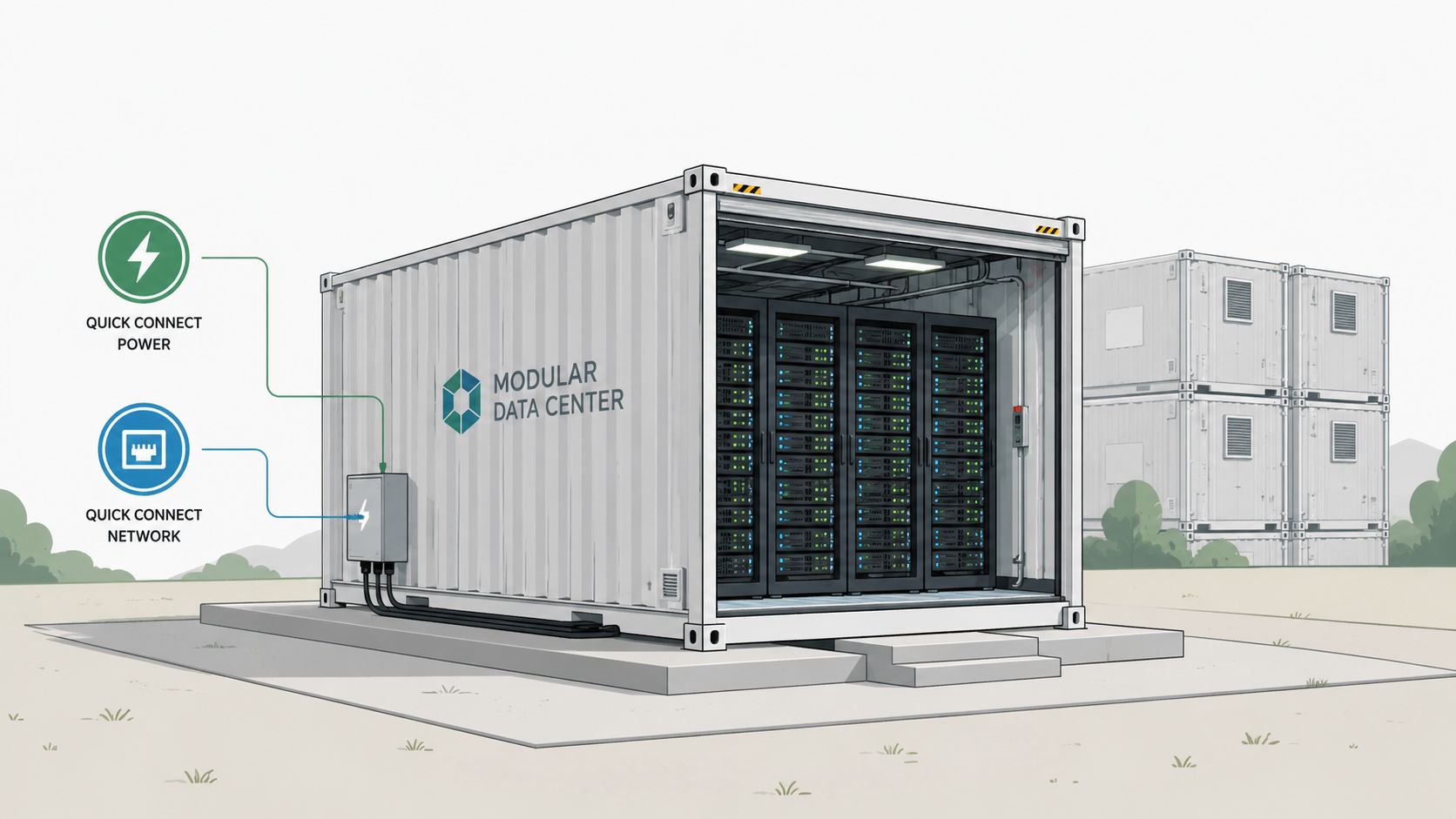
A modular data center pic changes the evaluation from building size to the speed, limits, and safety of adding capacity. A containerized or prefabricated unit may integrate computing, cooling, power, networking, and security in a compact enclosure. Its presence can indicate phased deployment, edge demand, retrofit constraints, or a temporary capacity plan, but the image alone cannot confirm operating status or available load.
Read the interfaces before judging the unit
Factory assembly can shorten site work because major components are prepared and tested before delivery. It does not remove local requirements. The module still needs dependable power, network connectivity, physical protection, maintenance access, and cooling suited to its workload and climate.
External power panels, fiber connections, cooling interfaces, lifting points, and service clearances reveal how the unit joins shared infrastructure. These details provide a practical test of operational maturity. A compact enclosure may look self-contained while relying on central switchgear, a network hub, generator capacity, or a site operations team. Check whether those dependencies are visible, documented, and serviceable.
Modular deployment can suit an operator entering a high-growth market without building a permanent campus at once. It can also place edge computing near a regional hub. The business case depends on more than installation speed. Allocate shared infrastructure, maintenance, security, and energy costs before deciding whether the module remains reasonable at scale.
Turn the site view into a risk screen
Use the photograph to record observations, then verify them through facility and site records:
- Deployment role: Assess whether the unit appears intended for edge workloads, temporary demand, retrofit capacity, or a longer-term campus plan.
- Infrastructure dependency: Trace connections to shared power, cooling, network, security, and facilities-management systems.
- Workload alignment: Compare the visible thermal and electrical design with the intended computing profile.
- Expansion path: Look for space, access routes, and connection points for additional units without creating new bottlenecks.
- Status verification: Confirm whether the photographed unit is active, planned, under construction, or a demonstration installation.
The image makes deployment architecture easier to examine. It cannot establish confirmed capacity, redundancy, or lifecycle cost. Pair visible evidence with facility records, site documentation, and clearly labeled estimates before treating modularity as a capacity advantage.
8-Point Data Center Comparison
| Component | Implementation complexity | Resource requirements | Expected outcomes | Ideal use cases | Key advantages |
|---|---|---|---|---|---|
| Server Racks and Equipment Density | Low–Medium (standardized; higher for extreme density) | High power & cooling, rack space, cabling | High IT capacity per footprint; increased cooling/power demand | Capacity-dense deployments, colocation, benchmarking | Standardization, efficient space use, rapid reconfiguration |
| Structured Cabling and Network Infrastructure | Medium–High (design & redundant routing required) | Skilled installers, fiber/copper materials, testing tools | Scalable bandwidth, high availability, easier maintenance | Carrier hotels, cloud interconnects, high-availability sites | Redundancy, scalability, simplified troubleshooting |
| Cooling Systems and Thermal Management | High (precision design; possible liquid integration) | Significant CapEx/OpEx, water/refrigerant, monitoring | Lower PUE, supports higher densities, reduced failures | Hyperscale, high-density racks, sustainability-focused centers | Improved efficiency, enables density, extends equipment life |
| Electrical Power Distribution and UPS Systems | High (redundant architectures, generator integration) | Large capital, batteries, fuel storage, space | Resilient continuous power, supports long runtimes, influences PUE | Tier III/IV facilities, critical enterprise, remote sites | Redundancy, scalable backup, long-duration autonomy |
| Physical Security and Access Control | Medium (multi-layer systems and procedures) | Security staff, CCTV/biometrics, access control systems | Reduced risk, compliance readiness, auditability | Regulated industries, high-value tenants, sensitive facilities | Defense-in-depth, audit trails, compliance support |
| Control Rooms and Building Management Systems | High (system integration, analytics, DCIM) | DCIM/BMS software, sensors, trained operators | Faster detection/response, predictive maintenance, full visibility | Large data centers, operators prioritizing automation | Centralized visibility, automation, data-driven optimization |
| Exterior Infrastructure and Site Planning | Medium–High (site studies, permitting, utilities) | Land, utility connections, environmental studies, permitting | Improved resilience, lower long-term risk, community acceptance | New builds, hyperscale campuses, risk-sensitive siting | Location-driven resilience, reduced operational risk, cost optimization |
| Modular and Prefabricated Data Center Units | Low–Medium (manufactured modules; integration work) | Vendor modules, site pad, power/network hookups, logistics | Rapid deployment, incremental capacity, flexible placement | Edge computing, temporary surge capacity, fast market entry | Fast time-to-deploy, scalability, lower upfront commitment |
Turn Visual Evidence Into Better Decisions
A data center pic becomes useful when it produces a testable question. The image should never be treated as proof of performance, capacity, redundancy, or sustainability. It should identify the component that deserves verification.
The first step is simple: name what is visible. A rack image shows equipment density and airflow arrangement. A cable image shows pathway organization. A cooling image shows equipment type and containment. A power image shows the apparent distribution architecture. An exterior image shows site interfaces and surrounding land use. Each observation should stay separate from information disclosed by the operator or estimated by an analytical platform.
The second step connects the visible feature to a meaningful metric. Rack density relates to IT power capacity and thermal load. Cooling equipment relates to PUE, WUE, climate suitability, and water exposure. Electrical paths relate to redundancy and deliverable capacity. Network routes relate to failure domains and expansion headroom. Modular units relate to deployment time, shared infrastructure, and phased investment risk.
The third step checks local conditions. Global demand can obscure the practical bottleneck at a proposed site. Recent IEA coverage reports that data-center electricity use rose 17% in 2025 and projects roughly 950 TWh by 2030, or about 3% of global electricity demand. The same material says data centers account for about 50% of demand growth through 2030, making grid queues, substation upgrades, and transmission timing central siting questions. These figures appear in the IEA executive summary on energy and AI.
Water analysis requires the same discipline. A U.S. fact sheet reports direct data-center water consumption rose from about 21.2 billion liters in 2014 to 66 billion liters in 2023, while the 176 TWh used by U.S. data centers in 2023 implied roughly 800 billion liters of indirect water use through power generation. The Environmental Law Institute water fact sheet.pdf) also notes that location, climate, water availability, rack density, and chip type materially affect demand. Ceres estimates that water associated with data-center electricity consumption could rise from 2.9 billion gallons to more than 14.5 billion gallons, while direct cooling-related use could increase from 385 million gallons to over 3.7 billion gallons, as documented in its regional water-stress report.
Data Center List supports this verification process across 6,052 facilities in 175 countries. Its directory and map cover active, planned, and under-construction sites, with facility profiles that distinguish disclosed IT power from AI-estimated values. Capacity-scaled markers, status filters, market views, operator listings, water-stress overlays, and sortable facility fields help turn a single image into a market and site comparison.
A compact review checklist should ask:
- Rack density: What equipment and airflow patterns are visible?
- Cooling: What PUE or WUE evidence is disclosed, and does the design fit local water conditions?
- Power paths: Are utility feeds, UPS systems, generators, and expansion capacity documented?
- Network redundancy: Do cable routes appear diverse, and can the operator verify them?
- Monitoring: Does the control environment connect power, cooling, security, and maintenance data?
- Security: Are perimeter, access, surveillance, and incident-response layers documented?
- Exterior risk: What do grid access, flood exposure, noise, transport, and neighboring land uses reveal?
- Water stress: Does the market context change the meaning of the cooling design?
- Modular scalability: Can additional units expand capacity without shifting the bottleneck elsewhere?
The strongest analysis keeps three labels visible throughout: observed, disclosed, and estimated. That separation prevents a compelling photograph from becoming an unsupported capacity claim.
Data Centers List offers a searchable global directory, interactive map, facility profiles, status filters, capacity fields, operator views, and water-stress context for evaluating the infrastructure behind each data center pic. Visit Data Centers List to compare active, planned, and under-construction facilities and turn visual impressions into evidence-aware site research.