8 Data Center Layout Diagram Examples for Every Scale
Discover 8 detailed data center layout diagram examples—from edge pods to hyperscale halls—with annotated templates and downloadable assets.
18 min read
A data center layout diagram is no longer a static floor plan. The shift is visible in the numbers that matter most, because the NIH Sustainable Data Center Design Guide defines layout efficiency as racks per 1,000 square feet of white space, with a typical range of 20 to 30, and calls a high-density data center one that runs racks at 14 kW and above. The same guide says an average data center has a PUE of 2.0, meaning two watts of facility power for every watt delivered to IT equipment, which is why layout decisions now shape energy, airflow, and expansion at the same time. NIH Sustainable Data Center Design Guide
That shift changes how operators should read a diagram. The best layouts show where power paths, cooling infrastructure, maintenance access, and future load will fit, not just where racks sit today. In practice, that makes the diagram a deployment tool for compact edge pods, phased colocation builds, and hyperscale halls that need room for denser racks and more constrained utility paths. The eight examples below focus on those real decisions, with annotated templates and tactical takeaways that work across facility scales.
Table of Contents
- 1. Hot Aisle/Cold Aisle Containment Layout
- 2. Row-Based or In-Row Cooling Layout
- 3. Modular or Containerized Data Center Layout
- 4. Liquid Cooling Loop Layout
- 5. Raised Floor Architecture with Plenum Distribution
- 6. Open-Plan or Non-Raised Floor Layout
- 7. Pod-Based or Micro Data Center Layout
- 8. Multi-Tier or Vertical Data Center Layout
- Comparison of 8 Data Center Layouts
- Putting Diagrams into Practice
1. Hot Aisle/Cold Aisle Containment Layout
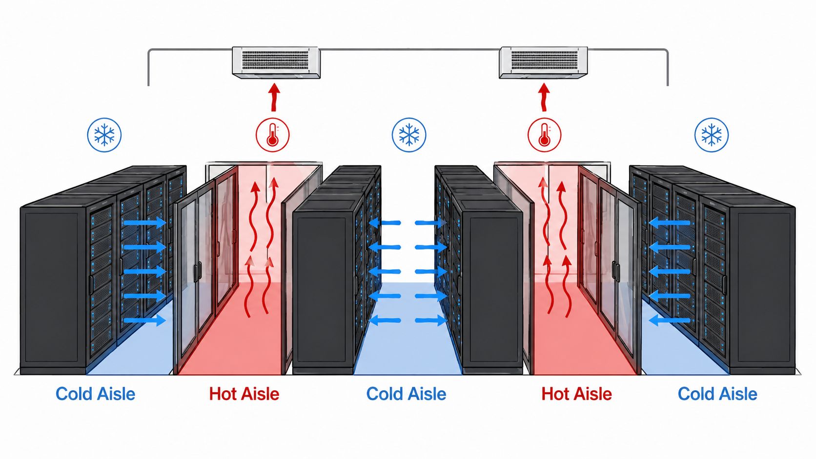
This is still the most recognizable data center layout diagram because it turns airflow into a visible operating model. Cold air reaches the front of the racks, hot exhaust stays separated in the rear aisle, and the diagram only works when that separation stays intact. A practical template usually shows alternating rack rows, containment boundaries, cooling unit placement, and sensor points at aisle entrances and return paths.
Why this layout still matters
The architecture is common in global colocation and cloud campuses because it gives operators a simple way to control thermal behavior without rebuilding the whole room. The planning logic lines up with the NIH guide's focus on density and airflow coordination, because once rack loads rise, the room has to be drawn around cooling behavior, not just row geometry. NIH Sustainable Data Center Design Guide
A useful diagram here marks cold aisles in one color and hot aisles in another, then overlays ceiling containment, access doors, and the location of variable-speed fans. It should also show where personnel entry points can breach containment, because the easiest layout on paper can be the hardest one to operate cleanly.
Practical rule: If a corridor doesn't show who can enter it, where air returns, and how breaches are tracked, the diagram is incomplete.
A strong tactical move is to pair the drawing with thermal imaging records and real-time sensor placement. That gives operators a way to compare intended airflow with actual airflow, which matters more than perfect symmetry in the plan view. For market-scale deployment, that logic fits large multi-site operators and global facilities such as the kinds listed in the Data Centers List directory, where standardized diagrams help teams compare buildings across regions.
2. Row-Based or In-Row Cooling Layout
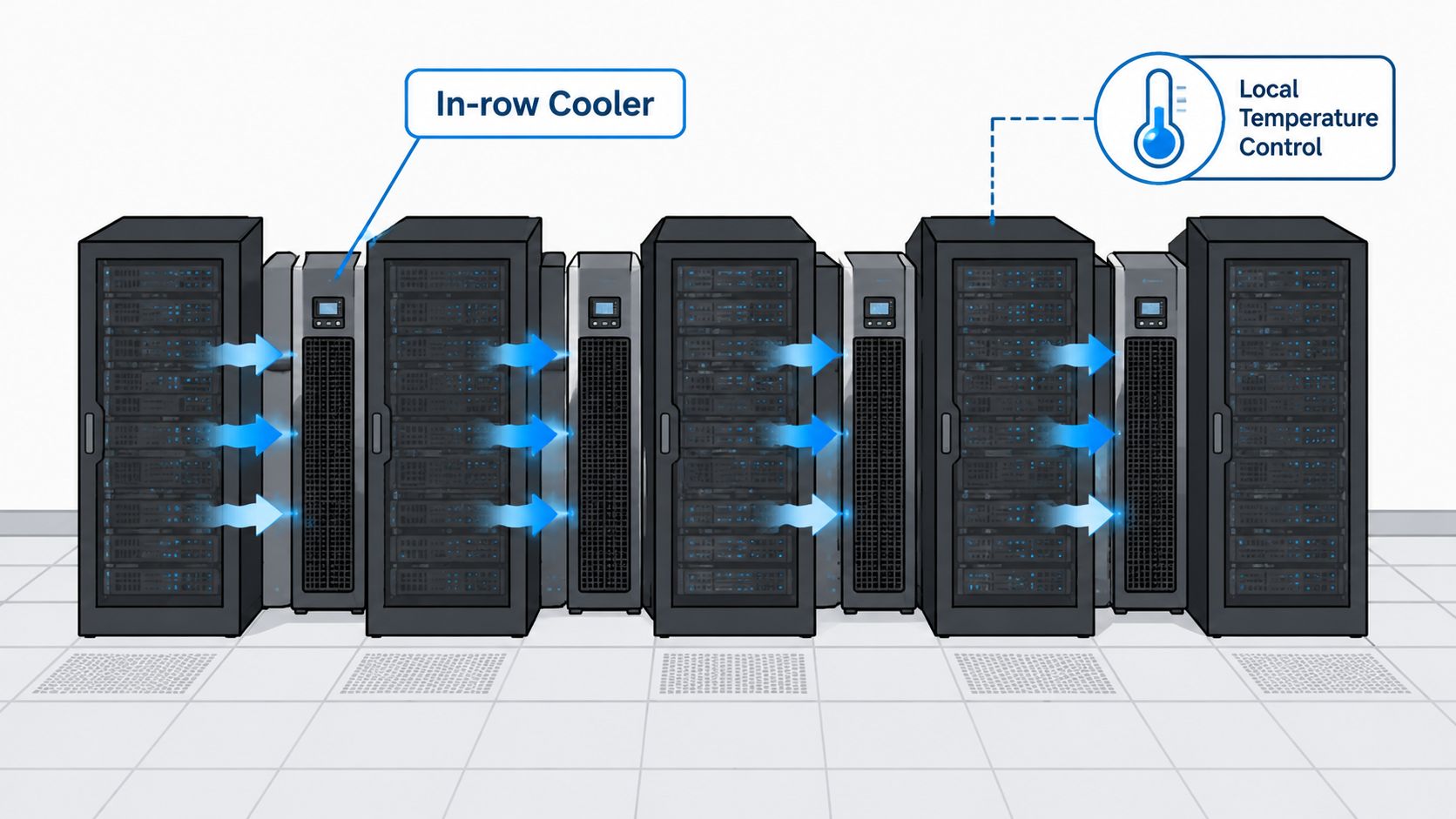
Row-based cooling changes the diagram from “one cooling zone for the room” to “cooling where the heat is born.” Instead of sending all thermal responsibility to the perimeter, the layout puts cooling units between or beside racks so the room can react to localized load. That's a better fit when a few aisles carry higher density than the rest.
How to read the room before deployment
The key tactical step is heat-load mapping before any equipment lands. A row diagram should identify which rows are likely to need localized cooling, which ones can stay on lighter-touch air handling, and where maintenance clearances will remain usable after the units are installed. That is especially important in sites with mixed workloads, because the layout has to acknowledge that not every rack row ages the same way.
The ROI of the layout is operational clarity, not just thermal improvement. When the drawing assigns cooling capacity to specific rows, it becomes easier to schedule preventive maintenance, balance service windows, and avoid the common problem of overbuilding the entire room for one dense zone. It also makes hybrid designs easier, since some aisles can still run with broader containment while the hottest rows get closer thermal control.
What the diagram should annotate
- Heat-load boundaries to show where localized cooling is necessary.
- Cooling unit capacity tied to each row, so future expansion is visible.
- Service access lanes for maintenance without moving adjacent cabinets.
- Sensor placement at the row edge, not just at the room perimeter.
- Fallback airflow paths for periods when one cooling module is offline.
A row-based drawing becomes especially useful in facilities that need to redeploy space quickly after a workload shift. The diagram should make those changes obvious, because the failure mode here is not lack of cooling power, it's misallocated cooling power.
3. Modular or Containerized Data Center Layout
A modular layout treats the data center layout diagram like a deployment map, not a building blueprint. Each module or container arrives with its own compute, power, cooling, and networking stack, then gets placed in a site plan that defines ingress, service access, and future expansion. A key benefit is speed, because the room design can be repeated instead of reinvented.
The site plan has to do more than fit boxes
A useful annotated template shows container orientation, utility tie-ins, turning radius for equipment delivery, and the routes for power and network handoff. The site itself matters as much as the module, since access roads, available power, and cooling-water availability can determine whether a containerized design is practical at all. When the plan is thin on logistics, the deployment is usually slower than the business case assumed.
Modular facilities are especially strong for edge sites, disaster recovery, and phased capacity adds. They let operators expand by adding discrete units rather than opening a much larger shell all at once, which keeps risk localized and makes decommissioning easier later. That same portability also means the diagram should include a relocation path, not just an installation path.
The best modular diagrams treat serviceability as a permanent requirement, not an afterthought.
In practice, that means showing how a technician reaches each module, how redundant units are separated, and how the surrounding site infrastructure supports a future swap-out. This approach works well when the core is centralized and the edge is distributed, since the diagram can express what stays fixed and what can move.
A downloadable template for this style should include a legend for module types, utility interfaces, and rack zoning. Without that, the layout becomes a pretty site sketch instead of an operational document.
4. Liquid Cooling Loop Layout
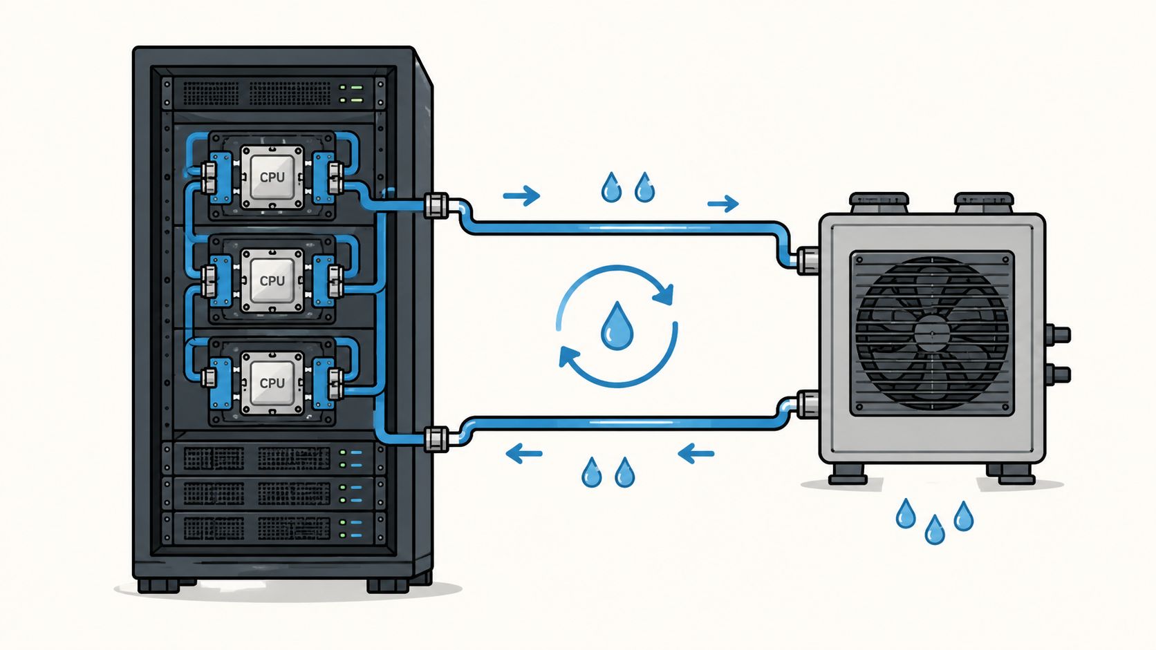
Liquid cooling changes the logic of a data center layout diagram more than any air-only refinement can. Once heat moves through direct-to-chip loops, rear-door heat exchangers, or immersion systems, the drawing has to show fluid routes, containment, drainage, and maintenance boundaries alongside racks and power. The U.S. Department of Energy notes that warmer intake air can reduce cooling energy and that modern planning should account for tighter sealing, under-floor management, and airflow optimization, which is exactly why liquid-aware diagrams need to be explicit about interfaces between air and fluid zones. U.S. Department of Energy data center design guidance
Hybrid is the safest starting point
A practical deployment pattern is hybrid zoning. High-density rows or AI clusters can use liquid cooling, while standard workloads remain on air, which keeps risk contained and lets teams validate the plumbing before converting the whole hall. The diagram should separate those zones clearly, because mixing them in one visual block hides the operational difference.
The most useful annotations are not decorative. They show coolant supply and return paths, isolation valves, leak detection points, emergency drainage, and the physical space needed to swap components without shutting down adjacent racks. If those elements are missing, the plan looks advanced but leaves maintenance teams guessing.
For dense AI clusters, this layout is no longer niche. Siemens' 100 MW blueprint shows NVIDIA GB200 NVL72 systems at 127 kW with N+1 power redundancy and 8 power shelves per system, which demonstrates why pod-level power and fluid planning has become a real design requirement rather than an optional upgrade. Siemens 100 MW blueprint
What to annotate in the template
- Coolant loop paths from supply to return.
- Leak detection zones around manifolds and exchange points.
- Drainage routes for spill response and maintenance.
- Hybrid boundaries between liquid-cooled and air-cooled racks.
- Component swap clearances so service does not spread across the hall.
A liquid cooling diagram earns its value when it shows how the room fails safely, not just how it runs efficiently. That distinction matters most in retrofit facilities where the shell was built for air cooling and the new workload wasn't.
5. Raised Floor Architecture with Plenum Distribution
Raised floor layouts still appear in a lot of mature facilities because they solve distribution in a familiar way. Cool air moves through the plenum beneath the floor, tiles deliver it where it's needed, and return air leaves through the ceiling or separate ducts. The challenge is that the diagram has to show bypass air, cable congestion, and floor integrity, not just tile placement.
Why older buildings still rely on this model
The layout remains common in enterprise, government, and financial facilities because it can be adapted rather than rebuilt. The NIH guide's emphasis on layout efficiency and the average PUE of 2.0 makes the point clearly, a room can still be operationally useful even if its spatial model is older, but the diagram has to account for power and thermal coordination if it's going to stay viable. NIH Sustainable Data Center Design Guide
A strong floor-plenum drawing marks pressure zones, blocked tiles, cable pathways, and perforated tile placement. It should also show where seals fail, because a raised floor might appear orderly yet still bleed airflow through cracks, penetrations, and poorly routed cables. That's why inspection metadata belongs in the diagram itself.
Standout point: In an older room, the floor drawing should show airflow problems before it shows future growth.
One tactical improvement is to combine raised-floor drawings with containment additions such as hot-aisle doors or aisle panels. That lets operators improve efficiency inside a legacy shell while preserving the structural layout they already own. In facilities that need phased modernization, that's often the most realistic path.
The strongest diagrams also reserve space for a future migration away from the plenum if equipment lifecycle and capital planning allow it. That makes the drawing a transition tool, not just a maintenance snapshot.
6. Open-Plan or Non-Raised Floor Layout
Open-plan designs remove the raised floor entirely, so the diagram has to explain airflow and cabling in the open, not underneath the room. Power and network paths move overhead or through conduits, racks sit on the structural slab, and service access becomes easier because technicians are not working around a plenum. The layout is attractive when teams want cleaner access and more flexible mechanical routing.
Accessibility drives the drawing
The biggest mistake in open-plan diagrams is treating the ceiling as empty space. It isn't. A good plan shows cable tray capacity, duct runs, dampers, airflow sensors, and the clearance needed for maintenance and future expansion. That keeps the design honest about how much infrastructure the room can carry.
This layout also works well when paired with modern containment strategies. The DOE guidance on sealing and airflow optimization fits naturally here, because overhead distribution can be organized around clearer airflow paths than many legacy plenum rooms allow. U.S. Department of Energy data center design guidance
A useful diagram should also label the floor surface load-bearing assumptions, drainage routes, and emergency access paths. Without those annotations, the room may be compliant on paper but awkward in practice. That's especially true in greenfield sites where the team wants a scalable mechanical model from day one.
Tactical features worth drawing in
- Overhead cable routes with spare capacity for later growth.
- Air distribution dampers with maintenance access points.
- Sensor locations that measure room-level and row-level conditions.
- Equipment clearances for replacement and evacuation.
- Utility corridors reserved for future expansion.
Open-plan layouts often win because they force more honest coordination between facilities and IT teams. The diagram becomes a shared operating document instead of a hidden mechanical drawing, which is exactly what modern deployments need.
7. Pod-Based or Micro Data Center Layout
Pod-based designs break the hall into discrete units, each with its own power, cooling, networking, and management boundary. That changes the data center layout diagram from a room-wide schematic into a fleet map, especially when each pod contains only a small number of racks. It is a clean fit for edge computing, secondary markets, and fast rollout scenarios where a full hall would be overkill.
The unit of planning is the pod
A good pod diagram doesn't start with the whole campus, it starts with the module. It shows rack count, power entry, cooling interfaces, network uplinks, and remote monitoring paths, then explains how multiple pods connect if the deployment scales. That lets teams reason about redundancy across pods instead of pretending one miniature unit can solve every failure mode on its own.
This layout is also operationally useful because it narrows the blast radius. If one pod needs work, the other pods can remain online, provided the interconnect plan and monitoring design were drawn correctly. The diagram should make those dependencies visible, not buried in a separate ops document.
Practical rule: In a pod architecture, redundancy belongs in the fleet, not inside every single box.
The best templates show standardized installation steps, vendor handoff points, and the route for remote management. That matters in distributed regions where technicians may not be onsite every day, and it also makes procurement easier because the same unit can be deployed repeatedly with fewer surprises. A pod layout is most effective when the diagram is so clear that local teams can install and operate without improvising.
For organizations with edge and core split across multiple sites, pod drawings are easiest to use when they're paired with an external directory of facilities and markets. That gives planners a way to decide where a pod belongs and how it complements the larger estate.
8. Multi-Tier or Vertical Data Center Layout
Vertical layouts make the diagram work upward instead of outward. Multiple floors or tiers let operators place more infrastructure inside a smaller footprint, which is especially relevant in dense urban markets where land constraints drive every planning choice. The visual challenge is that the drawing has to handle load paths, cable risers, cooling by level, and safe movement of equipment between floors.
Structural planning has to come first
A vertical data center diagram should begin with structural limits, not equipment placement. That means showing floor loading, lift access, stairs, backbone routing, and the service path for large hardware. If the layout does not account for vertical transport, maintenance becomes the hidden bottleneck.
Cooling deserves special attention because upper and lower tiers don't behave identically. The diagram should show per-floor cooling boundaries, not assume one centralized system will distribute evenly across stacked spaces. That is one reason vertical facilities often pair well with distributed cooling rather than a single-room thermal model.
The strongest plans also include a 3D reference model, even if the public-facing diagram stays 2D. That helps teams visualize future modifications, backbone routing, and equipment swaps without turning every floor into a separate design island. It also prevents the common mistake of placing the densest infrastructure where access is hardest.
What the layout should show explicitly
- Vertical load paths and structural constraints.
- Lift dimensions and service redundancy.
- Per-floor cooling zones instead of one shared assumption.
- Cable risers and backbones across all levels.
- Tier-specific maintenance access for safe operations.
In cities where space is scarce and real estate pressure is persistent, the vertical layout makes sense because it uses the footprint efficiently. The diagram only works if it reflects the operational cost of that efficiency, especially the need for careful movement, monitoring, and separation between levels.
Comparison of 8 Data Center Layouts
| Layout | Implementation complexity | Resource requirements | Expected outcomes | Ideal use cases | Key advantages |
|---|---|---|---|---|---|
| Hot Aisle / Cold Aisle Containment Layout | Moderate, requires rack orientation and containment installation | Moderate capex for barriers, sensors; uses standard HVAC | Improved cooling efficiency; lower PUE (~1.5–1.8); reduced hot/cold mixing | General-purpose and retrofit data centers | Proven, scalable, relatively easy retrofit; broad industry support |
| Row-Based / In‑Row Cooling Layout | High, distributed units and control integration | Higher capex for multiple in‑row units and advanced controls | Granular thermal control; lower PUE (~1.4–1.6); effective hotspot management | High‑density racks, heterogeneous workloads, new builds | Localized cooling, better density handling, modular scalability |
| Modular / Containerized Data Center Layout | Low–Moderate, factory-built modules but requires logistical planning | High per‑module cost; transport, site prep, and plug‑in utilities | Rapid deployment and predictable capacity; modular scaling | Edge sites, remote locations, rapid expansion, DR | Fast deployment, portability, factory-tested and repeatable |
| Liquid Cooling Loop Layout | Very high, specialized design, leak containment, integration | High capex and specialized components; skilled operations required | Very low PUE (possible 1.1–1.3); enables very high power density (50+kW+/rack) | HPC, AI/ML, GPU clusters, extreme density workloads | Highest cooling efficiency; supports extreme rack power densities |
| Raised Floor Architecture with Plenum Distribution | Moderate, conventional but infrastructure‑heavy | Significant structural and HVAC investment; underfloor plenum maintenance | Mature, reliable operation but higher baseline PUE (2.0–2.5) unless optimized | Legacy enterprise facilities and Brownfield sites | Proven design, excellent cable management, extensive operational expertise |
| Open‑Plan / Non‑Raised Floor Layout | Moderate, overhead routing and airflow engineering needed | Moderate: overhead trays, ceiling HVAC, enhanced monitoring | Lower structural cost; efficient when combined with modern cooling (PUE ~1.4–1.6) | New greenfield builds, hyperscalers, flexible modern deployments | Greater flexibility, easier reconfiguration, better compatibility with in‑row solutions |
| Pod‑Based / Micro Data Center Layout | Low, compact self‑contained pods simplify site work | Low site infra needs but higher cost per MW; remote management tools | Fast, low‑infrastructure deployments; higher per‑MW cost | Edge computing, small markets, telco and retail locations | Rapid deployment, minimal site prep, scalable by adding pods |
| Multi‑Tier / Vertical Data Center Layout | Very high, complex structural, transport and fire/safety planning | High construction, structural reinforcement, and advanced systems | High rack density per sqft; lower real‑estate cost per MW in urban markets but complex ops | Urban/prime real estate markets where footprint is constrained | Maximizes real‑estate efficiency; enables high density in premium locations |
Putting Diagrams into Practice
A data center layout diagram's value lies not in visual polish. It is whether the plan helps operators place power, cooling, access, and expansion in a way the building can sustain. The NIH guide's layout efficiency benchmark, the average PUE of 2.0, and the definition of high-density at 14 kW and above all point to the same conclusion, layout is now a performance decision, not a drafting exercise. NIH Sustainable Data Center Design Guide
That matters across every facility scale. A hot-aisle room needs containment discipline, a row-based hall needs heat mapping, a modular site needs logistics, and a liquid-cooled AI zone needs fluid-aware failure planning. The best teams don't treat those as separate design philosophies, they treat them as templates that can be mixed as workload density changes.
The tactical next step is simple. Download an annotated layout template, mark the power envelope, mark the cooling envelope, and then compare that drawing against the actual room geometry, access paths, and upgrade plan. The Siemens blueprint shows how quickly rack density and pod planning can push a design toward new power envelopes, while the DOE guidance shows why airflow and sealing still matter even in more advanced rooms. Siemens 100 MW blueprint U.S. Department of Energy data center design guidance
Operators should also revisit the diagram every time a site changes from one thermal model to another, or from one resilience posture to a more fault-isolated one. The APC planning guide underscores how room geometry, doors, columns, aisle spacing, and sealed penetrations affect accessibility and cooling performance, which is why a “finished” drawing is rarely finished in practice. APC planning guide on room geometry and airflow constraints
The strongest deployment teams use diagrams as living documents. They annotate capacity, track utilization, and update the room plan before expansion gets blocked by the wrong aisle width, the wrong cooling assumption, or the wrong power split. That is how layout stops being a one-time artifact and becomes part of the facility operating system.
Data Centers List gives operators, planners, and analysts a practical way to find facilities, compare markets, and study capacity signals in one place. Use Data Centers List to connect these layout templates to real sites, benchmark active and planned facilities, and sharpen the next deployment decision with a clearer view of power, status, and market context.