Data Center Heat Map Explained and How to Read It
Learn what a data center heat map is, how thermal and geographic maps are built, how to read them, and which tools and data sources to use.
13 min read
A site-selection team opens a colorful data center heat map expecting a simple answer: find the darkest red areas and build there. Instead, the screen shows red server aisles, red geographic clusters, and red pipeline markers, all using the same visual language for completely different conditions. The confusion is understandable. A “hot” room can mean equipment is overheating, while a “hot” market may mean demand is concentrated, power is scarce, or projects are merely being announced.
A useful data center heat map starts by separating those meanings. One map helps an operator understand airflow and cooling inside a facility. The other helps a site selector compare infrastructure markets, capacity, development activity, and local constraints. Treating them as interchangeable can turn a promising location into a delayed project, or cause an operations team to miss a rack-level problem hidden inside an acceptable room average.
The practical task is therefore larger than reading colors. A reader needs to know what data created the map, what the intensity scale represents, whether the capacity is operational or speculative, and which constraints sit underneath the visual layer. The following guide builds that understanding from thermal physics to market geography, then adds the checks needed to judge deliverable power, water exposure, and community risk.
Table of Contents
- Introduction to Data Center Heat Maps and Why They Matter
- What a Data Center Heat Map Really Shows
- How Thermal and Geographic Heat Maps Are Created
- Where Heat Maps Are Used From Operations to Market Intelligence
- How to Read and Interpret a Data Center Heat Map Like an Analyst
- Tools and Data Sources Behind Reliable Heat Maps
- Choosing and Using the Right Heat Map for Your Goal
Introduction to Data Center Heat Maps and Why They Matter
A reader searching for a data center heat map may be standing in one of two situations. An facilities engineer might be reviewing a thermal image after a cooling complaint, while a site-selection analyst might be comparing markets before commissioning a feasibility study. Both users see a gradient of colors, but they're asking different questions and relying on different evidence.
The in-room user wants to know whether hot air is moving as designed. A thermal visualization can reveal a rack that receives warmer supply air than neighboring equipment, an aisle with uneven airflow, or a vertical temperature pattern that disappears when readings are averaged. The market user wants to know where facilities cluster, how much capacity exists, and whether a proposed region can support another project.
Those questions have different consequences. An operations team may adjust airflow management, investigate a cooling control, or validate a computational fluid dynamics model. A site selector may eliminate a market because grid access, construction timing, water availability, or permitting conditions make announced capacity unreliable.
A geographic directory such as the global data center directory can help establish the market-level picture, but the reader still needs to understand what its markers and status categories mean. A facility marker is not the same thing as a live power allocation, just as a red patch on a floor plan isn't automatically a system failure.
Core distinction: A thermal heat map describes conditions inside a facility. A geographic heat map describes the distribution and development of facilities across places.
The rest of the analysis follows that distinction. First, it defines the two map types. Next, it shows how sensors, imagery, facility records, and capacity estimates become visual layers. Finally, it explains how an analyst can test whether a market's apparent heat represents usable opportunity or pressure that may block delivery.
What a Data Center Heat Map Really Shows
A weather map offers the easiest comparison. Blue and red represent different temperatures, but the colors only become useful when the legend explains the scale, the time, and the location. A data center heat map works the same way. Color is a visual shortcut, not a conclusion.
The first form is an in-room thermal map. It represents temperature and airflow conditions across equipment, racks, aisles, and sometimes multiple elevations. Its audience is usually an operator, commissioning engineer, facilities manager, or cooling specialist. The map helps identify localized hot spots, cold regions, vertical stratification, and differences between the front and rear of cabinets.
The second form is a geographic market heat map. It places facilities on a regional, national, or global map and uses color, marker size, or density to show an attribute such as facility count, IT capacity, operating status, or development concentration. Its audience includes site selectors, infrastructure investors, developers, analysts, and policymakers.
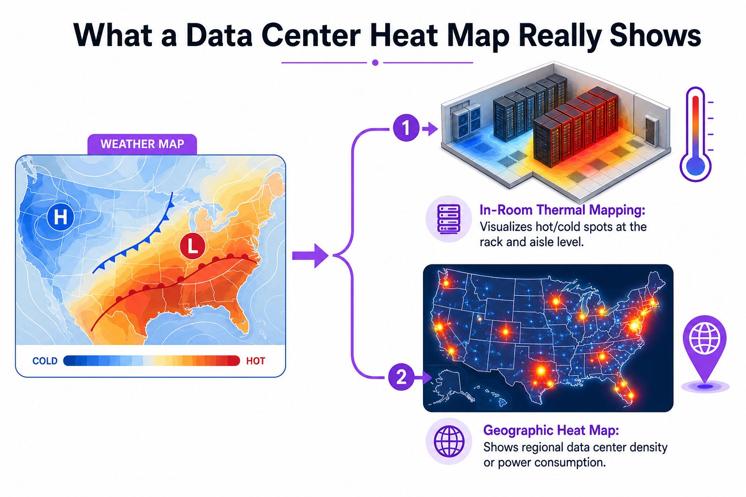
The same visual language, different evidence
A thermal map is built from physical measurements taken in a room. A geographic map is built from facility records, market attributes, capacity information, project status, and location data. The first describes an observed condition. The second summarizes a distributed inventory or pipeline.
Reading rule: Before interpreting a color, identify the mapped variable. “Hot” might mean high temperature, high capacity density, high development activity, or high constraint. Those are not interchangeable.
A geographic map also needs a clear unit of aggregation. A country may appear intense because it contains many facilities, because a smaller number of facilities has substantial capacity, or because planned projects have been included alongside operating sites. A city cluster may look attractive under one measure and constrained under another.
Thermal maps require the same discipline. A room-wide average can look acceptable while individual racks receive poor airflow. Conversely, a cold area may indicate spare cooling capacity, but it may also signal overcooling and inefficient control. The map becomes useful only when its legend, timestamp, measurement method, and operating context are visible.
How Thermal and Geographic Heat Maps Are Created
Thermal mapping begins with the room, not the color palette. Operators collect temperature and airflow samples at rack or aisle level, often at multiple rack elevations, so the resulting view can expose vertical stratification and front-to-rear cabinet differences. Those patterns are difficult to see in a single aggregate reading.
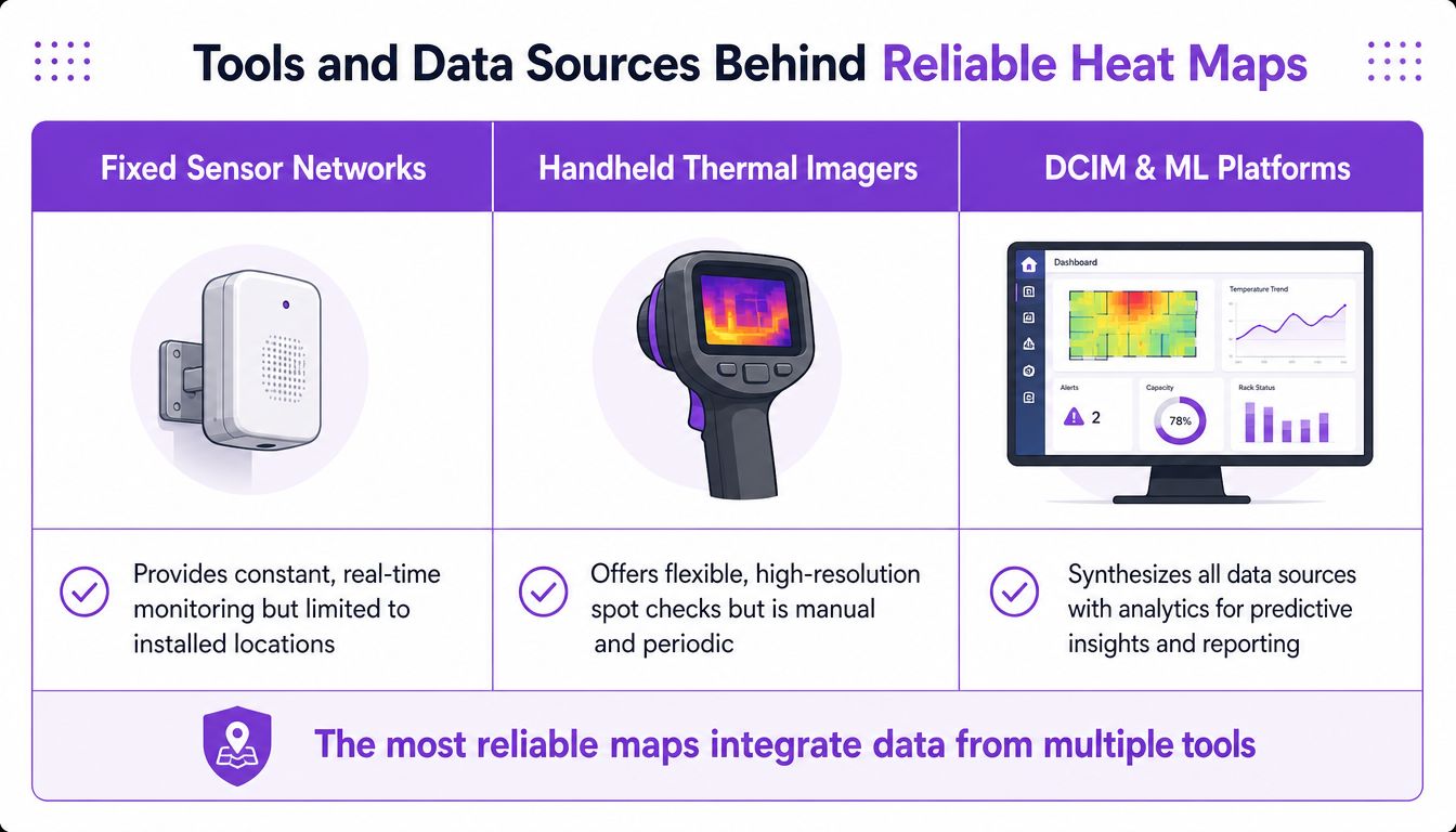
Teams may use fixed sensor networks, handheld thermal imagers, or a combination of both. Fixed sensors support continuous observation at installed points. Handheld imagery provides flexible spot checks across surfaces and equipment, although it depends on the operator's route and timing.
The collection process should be ordered rather than random. Thermal and visual imagery can be gathered systematically, then post-processed into a two-dimensional or three-dimensional representation. The measured in-situ condition is compared with computational fluid dynamics design models to test whether airflow and cooling match the intended design or whether localized hot spots have emerged, as described in this thermal mapping methodology.
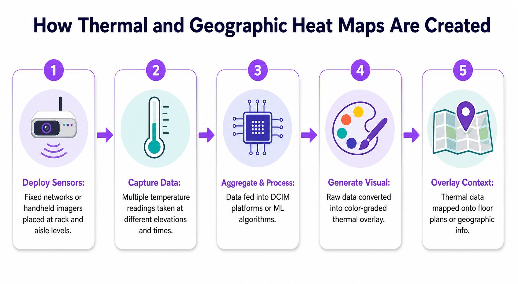
From measurements to operational output
The output isn't just a picture. It can support HVAC control, fault investigation, commissioning validation, and problem detection. Research prototypes have also used detailed thermal maps for intelligent sampling and anomaly detection, while machine-learning approaches have modeled thermal topology in very large facilities. That progression turns a static snapshot into a possible predictive operating layer.
Geographic heat maps follow a different chain. The mapmaker aggregates facility locations, operating status, operator information, capacity fields, and development records. Public disclosures may be combined with open geographic sources and planning information, but every field needs a methodology label because disclosed capacity and estimated capacity carry different confidence levels.
A market map can then apply visual rules:
- Marker size represents a capacity measure or another selected magnitude.
- Color separates active, planned, and under-construction facilities.
- Density layers show clusters at a regional scale.
- Context overlays add grid, water, land, permitting, or community information where available.
The analyst must ask whether the map counts buildings, campuses, power, or projects. Two maps can show the same region and reach different conclusions because one emphasizes facility count while another weights markers by IT power. A pipeline-heavy map can also look hotter than the operating inventory suggests.
A useful data center predictive modeling resource illustrates why the data layer matters. Predictive outputs are only as credible as the observations, labels, assumptions, and update process behind them.
Where Heat Maps Are Used From Operations to Market Intelligence
Thermal and geographic maps serve different decision cycles. A facilities team may use a thermal view during commissioning, after a load change, or when an alarm points to a cooling imbalance. A market analyst may use a geographic view during portfolio planning, site screening, investment analysis, or infrastructure benchmarking.
The operations view
Inside a facility, the map turns an invisible airflow problem into a spatial one. An operator can compare supply and return conditions, look for recurring hot spots, and connect temperature changes with equipment placement or workload patterns. The result can guide targeted investigation instead of prompting a broad and potentially wasteful cooling increase.
The map can also support real-time control. When thermal data feeds a building or infrastructure management system, operators can use changing conditions to identify abnormal behavior and adjust cooling responses. The operational value comes from linking the visual pattern to a timestamp, an equipment state, and a corrective action.
The market view
At the geographic level, concentration is the first signal. As of March 2025, the United States had 5,426 data centers, compared with 529 in Germany and 523 in the United Kingdom, according to country-level data center counts. Those figures describe facility counts, not automatically available power, but they show why a global map tends to produce dense clusters rather than an even distribution.
A separate market interpretation may focus on capacity instead of count. A region with fewer, larger facilities can carry more potential load than a region with many smaller sites. That's why a site selector should compare at least three visual layers:
- Existing inventory, which indicates what is already operating.
- Development pipeline, which indicates what is planned or under construction.
- Constraint context, which indicates whether additional projects can realistically connect, receive permits, obtain water, and reach operation.
The same market can look attractive in a demand map and difficult in an execution map. A dense cluster may confirm connectivity, labor, and ecosystem advantages, while also signaling scarce land, power queues, or community resistance.
A market heat map is most useful when it shows both opportunity and friction. Density alone can't tell a site selector whether the next facility is deliverable.
How to Read and Interpret a Data Center Heat Map Like an Analyst
The first task is to read the legend before reading the map. A deep color might represent a high measured temperature, a large capacity marker, a high facility count, or a severe constraint overlay. Without the variable, threshold, timestamp, and unit, visual intensity has no reliable meaning.
For an in-room thermal map, the analyst should inspect the pattern rather than focus on one isolated pixel. Rack-level and aisle-level samples, collected at multiple elevations, can reveal vertical stratification and front-to-rear differences that a room average conceals, as documented in this thermal topology research.
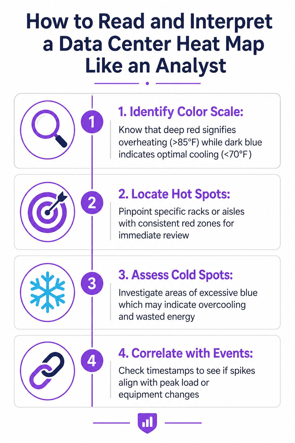
A practical reading sequence
Start with location. In a thermal view, locate the rack, aisle, cabinet face, or elevation associated with the strongest signal. In a market view, locate the city, region, or corridor where markers cluster.
Check persistence. A recurring zone is more operationally important than a single reading captured during an unusual event. The map should be reviewed against timestamps, load conditions, maintenance activity, and changes in airflow management.
Separate heat from opportunity. A market can be “hot” because demand is high while deliverable capacity remains limited. Recent market materials report 0.3% vacancy in Northern Virginia and 1% in Atlanta in Q1 2026, while more than 66 GW was under construction in North America and 77% of that construction capacity was in frontier markets, according to global data center trends. The figures point to a gap between established demand centers and newer development locations.
Test the pipeline. Planned capacity deserves a different visual treatment from operating capacity. The analyst should ask whether each project has a credible site, grid path, permitting position, construction status, and expected delivery sequence.
Add constraint overlays. Water stress, cooling choice, grid bottlenecks, land availability, and community acceptance can change the meaning of a bright market cluster. A national poll cited in the market research found 44% of Americans would support a data center near where they live, while 42% would oppose it, according to the same global trends report. Social license therefore belongs beside capacity, not in a separate afterthought.
Tools and Data Sources Behind Reliable Heat Maps
Reliable maps combine measurement tools with transparent data handling. Thermal teams may use fixed sensors for continuous monitoring, handheld imagers for targeted inspections, and data-center infrastructure management systems to consolidate readings. Predictive models can then learn normal thermal topology and flag deviations, but they shouldn't hide the underlying measurements.
Geographic mapping requires a different toolkit. A market directory may assemble facility coordinates, operator records, operating status, capacity fields, planning information, and public disclosures. The important question isn't whether every value looks precise. It's whether the map clearly separates disclosed values, estimated values, and unverified pipeline assumptions.
Choosing the right evidence layer
| Mapping need | Primary evidence | Main strength | Main limitation |
|---|---|---|---|
| Room diagnostics | Fixed sensors and thermal imagery | Finds spatial temperature and airflow patterns | Coverage depends on placement and timing |
| Cooling validation | Measured conditions compared with design models | Tests whether the built room performs as intended | Model assumptions may differ from live operations |
| Predictive operations | Historical telemetry and analytical models | Identifies recurring patterns and possible anomalies | Predictions require clean, representative data |
| Market screening | Facility records, capacity fields, and status labels | Compares regions and development pipelines | Announced capacity may not equal deliverable power |
A trustworthy geographic map should expose its update date and status definitions. “Active,” “planned,” and “under construction” answer different questions, so combining them into one undifferentiated heat layer can mislead a site selector.
Data Centers List is one market-intelligence option that presents facility locations, status, operators, and capacity fields through an interactive directory and map. Its operator listings can help users examine how assets are distributed by brand and market, while a separate operational thermal system would still be needed for rack-level diagnosis.
Evidence discipline: A colorful map earns trust by showing what is measured, what is disclosed, what is estimated, and what remains uncertain.
Choosing and Using the Right Heat Map for Your Goal
The right map depends on the decision. A facilities manager needs room-level temperature and airflow evidence tied to equipment locations and operating times. A site selector needs geographic capacity, facility status, delivery prospects, and local constraints. A single visual cannot answer both questions unless it clearly connects two separate data layers.
A practical market review should ask:
- What does the color measure? Temperature, capacity, facility count, demand, or constraint?
- What is included? Operating sites, planned projects, under-construction facilities, or all categories together?
- How current is the record? Old status information can turn a live inventory view into a historical snapshot.
- Which values are disclosed? Estimated IT power should remain visibly distinct from operator-published figures.
- Can the map show friction? Grid access, water stress, permitting conditions, and community acceptance may matter as much as demand.
- Does the map show deliverability? A large pipeline isn't proof that power, land, and approvals are available.
The strongest data center heat map therefore isn't the one with the most dramatic colors. It's the one that lets a reader distinguish physical conditions from market conditions, operating inventory from speculative demand, and opportunity from constraint. Used that way, heat mapping becomes a decision framework rather than a decorative visualization.
Site selectors, operators, and analysts can use Data Centers List to browse global facilities, compare operating and pipeline status, review capacity fields, and examine market context such as water stress. Visit the directory to test a map against the specific locations and delivery questions shaping the next infrastructure decision.